Mapping Data to Graphics
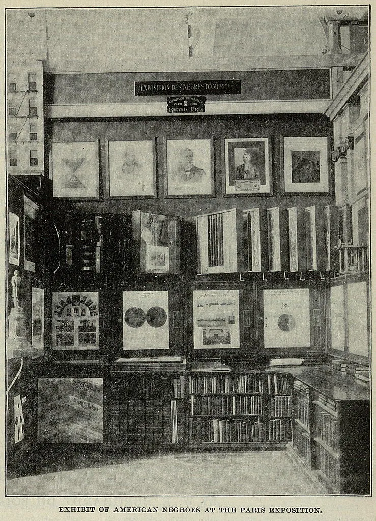
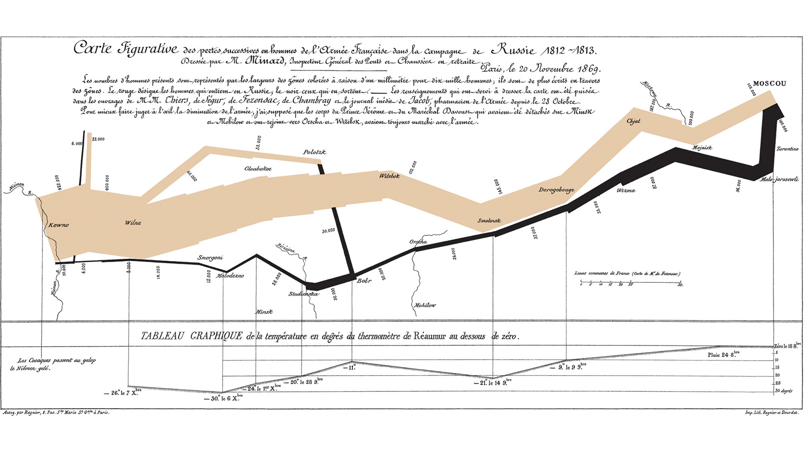
W.E.B. Dubois at the Paris Exhibition

Mapping data to aesthetics
Aesthetic
Visual property of a graph
Position, shape, color, etc.
Data
A column in a dataset
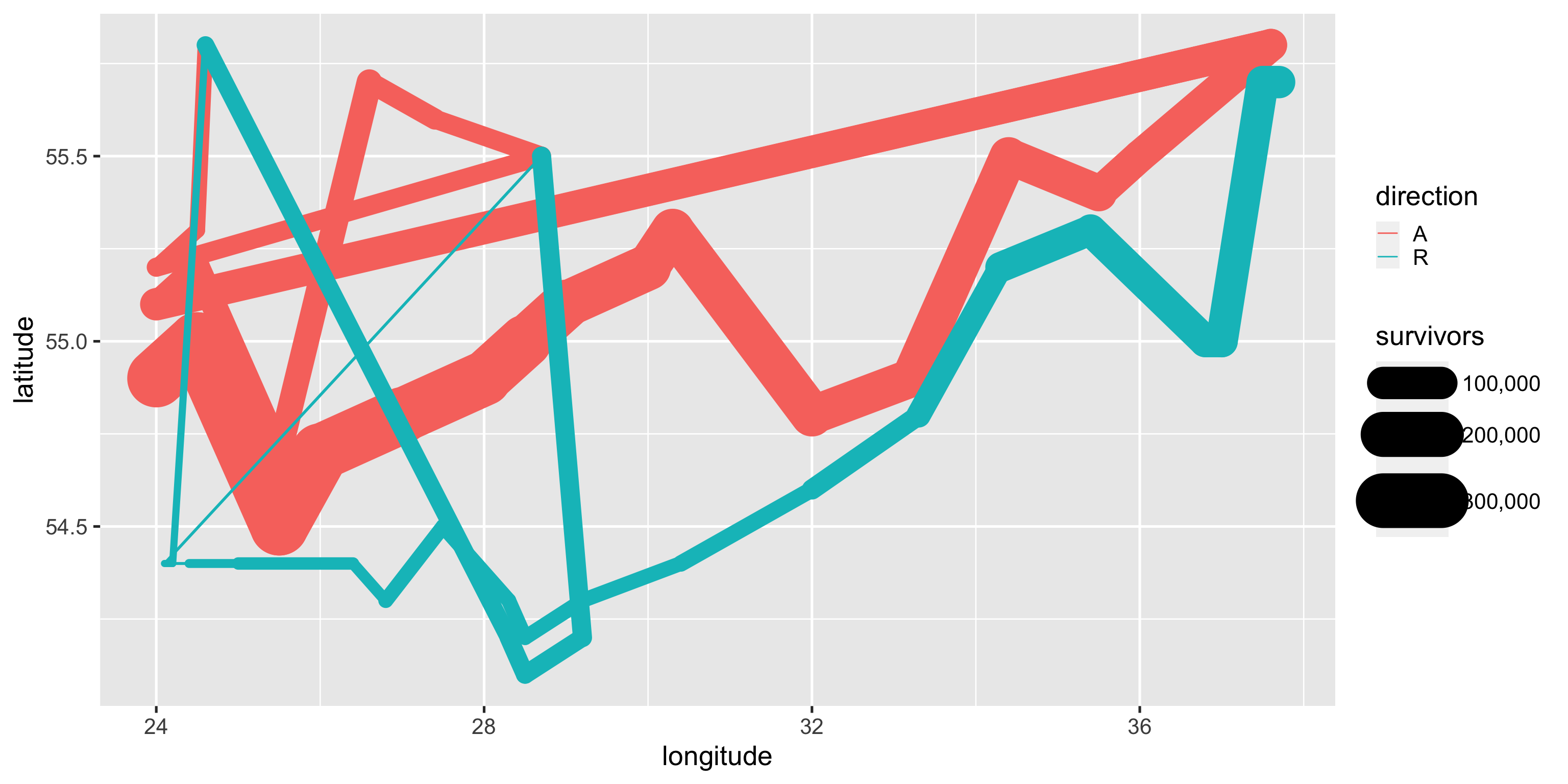
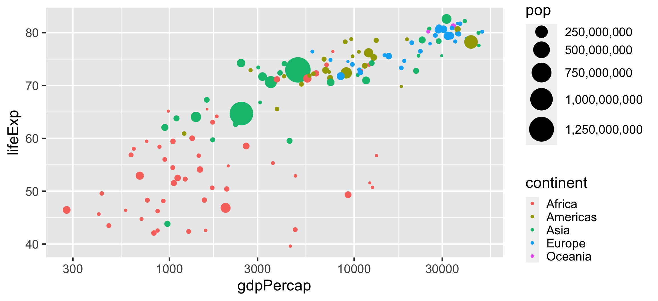
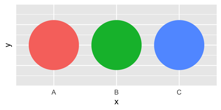
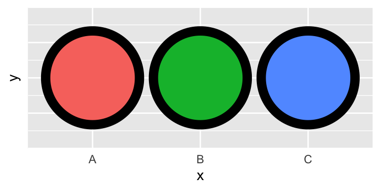
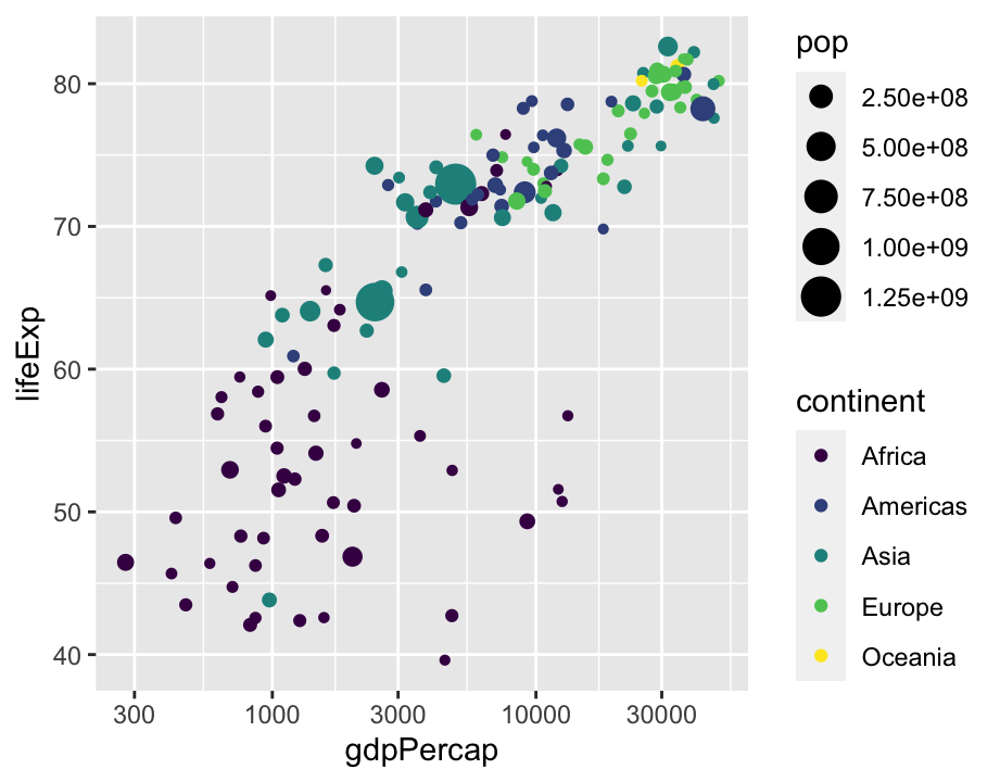
Aesthetics: color(discrete)
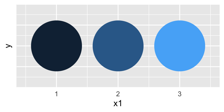
Aesthetics: color(continuous)
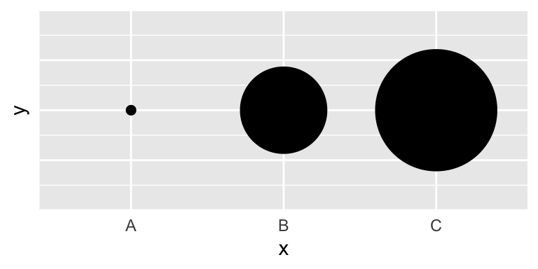
Aesthetics: size
Aesthetics: fill
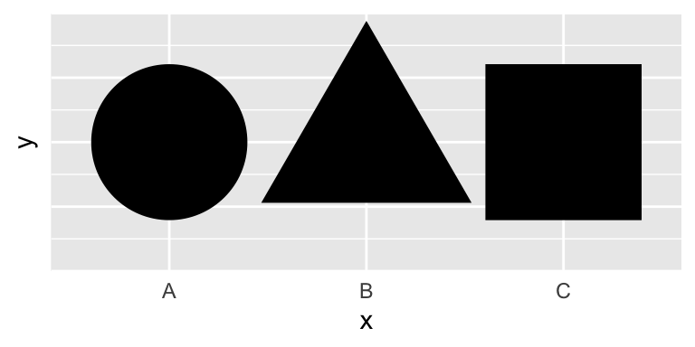
Aesthetics: shape
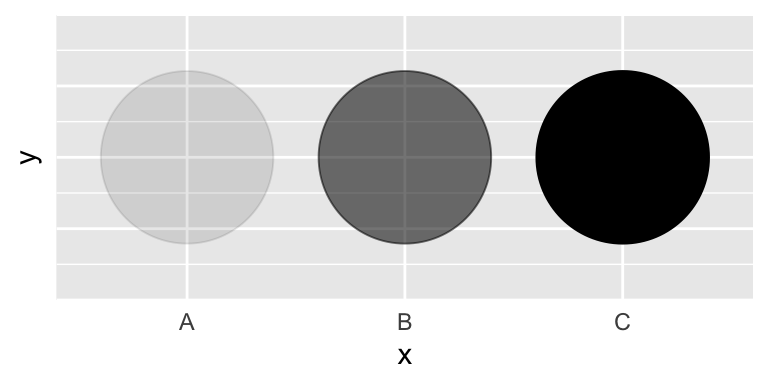
Aesthetics: alpha
| Example geom | What it makes | |
|---|---|---|
 |
geom_col() |
Bar charts |
 |
geom_text() |
Text |
 |
geom_point() |
Points |
 |
geom_boxplot() |
Boxplots |
 |
geom_sf() |
Maps |
scale_x_log10()
scale_color_viridis_d()
Code
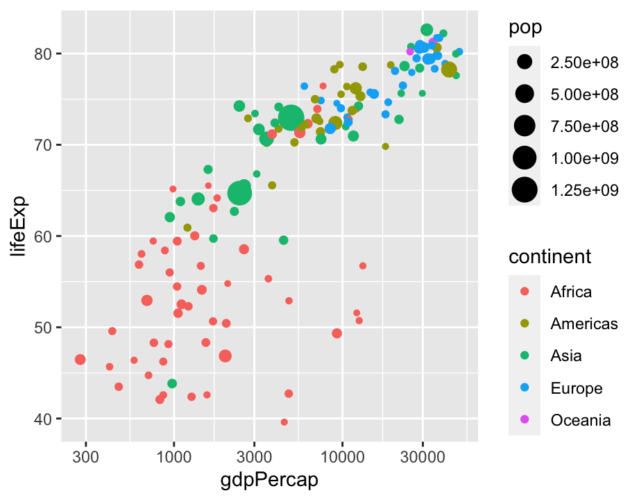
ggplot(gapminder, aes(x = gdpPercap, y = lifeExp,
                      size = pop, color = country)) +
  geom_point(alpha = 0.7) +
  scale_size(range = c(2, 12)) +
  scale_x_log10(labels = scales::dollar) +
  guides(size = "none", color = "none") +
  facet_wrap(~continent) +
  # Special gganimate stuff
  labs(title = 'Year: {frame_time}', x = 'GDP per capita', y = 'life expectancy') +
  transition_time(year) +
  ease_aes('linear')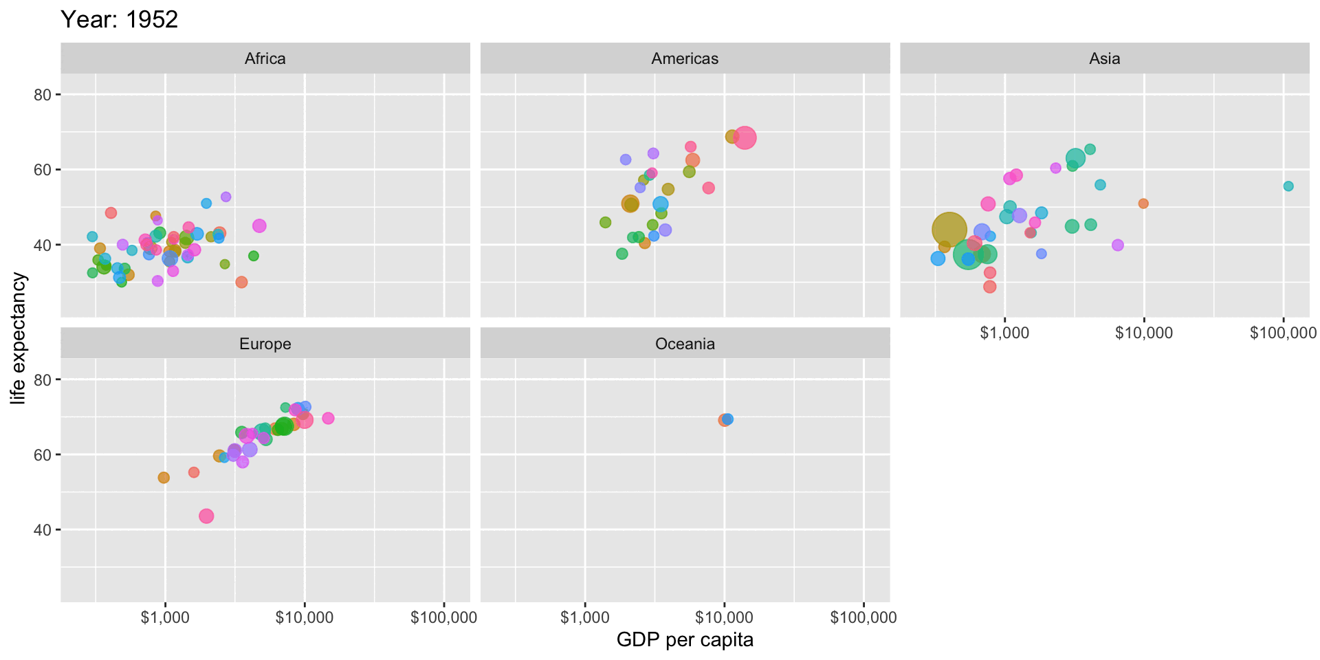
To-Do
Before next class:
Make a graph using the county census data set. You can use any geom you like, but you must map a variable to color.
note pay attention to whether you are mapping color to a discrete variable or a continuous variable
Use
ggsave("yourfilename.png")after your ggplot code and post it to our Teams site
Pick a data viz from Data Viz Catalog and be ready to summarize what it is, and when it might be useful in class.