Exploratory Data Analysis

Dr. Nathaniel Cline

Agenda

1

Exploring Numerical Data

2

Exploring Categorical Data

3

Finding Stories

4

Review and to do

County Example Data

Code
county |>
  select(state, name, pop_change, pop_change_2levels, median_hh_income) |>
  filter(!is.na(pop_change)) |>
  group_by(pop_change_2levels) |> 
  slice_sample(n = 5) |>
  arrange(pop_change_2levels, state, name) |>
  rename(
    State = state,
    County = name,
    `Population change (%)` = pop_change,
    `Gain / No gain` = pop_change_2levels,
    `Median household income` = median_hh_income
  ) |>
  kbl(linesep = "", booktabs = TRUE, align = "llccc") |>
  kable_styling(bootstrap_options = c("striped", "condensed"), 
                latex_options = c("striped", "hold_position"), full_width = FALSE) |>
  column_spec(3, width = "8em") |>
  column_spec(4, width = "4em") |>
  column_spec(5, width = "8em")
The median household income from a random sample of 5 counties with population gain between 2010 to 2017 and another random sample of 5 counties with no population gain.
State County Population change (%) Gain / No gain Median household income
Georgia Murray County 1.35 gain 41617
Georgia Rabun County 2.46 gain 39297
Missouri Audrain County 0.38 gain 44056
Montana Wheatland County 0.80 gain 37222
Texas Tyler County 0.20 gain 44396
Arkansas Pike County -3.46 no gain 36893
Illinois Rock Island County -1.85 no gain 51426
Iowa Hamilton County -1.47 no gain 55836
Nebraska Scotts Bluff County -1.33 no gain 47975
Oklahoma Seminole County -2.21 no gain 37741

The Loans Example Data

Code
glimpse(loans)
Rows: 10,000
Columns: 55
$ emp_title                        <chr> "global config engineer ", "warehouse…
$ emp_length                       <dbl> 3, 10, 3, 1, 10, NA, 10, 10, 10, 3, 1…
$ state                            <fct> NJ, HI, WI, PA, CA, KY, MI, AZ, NV, I…
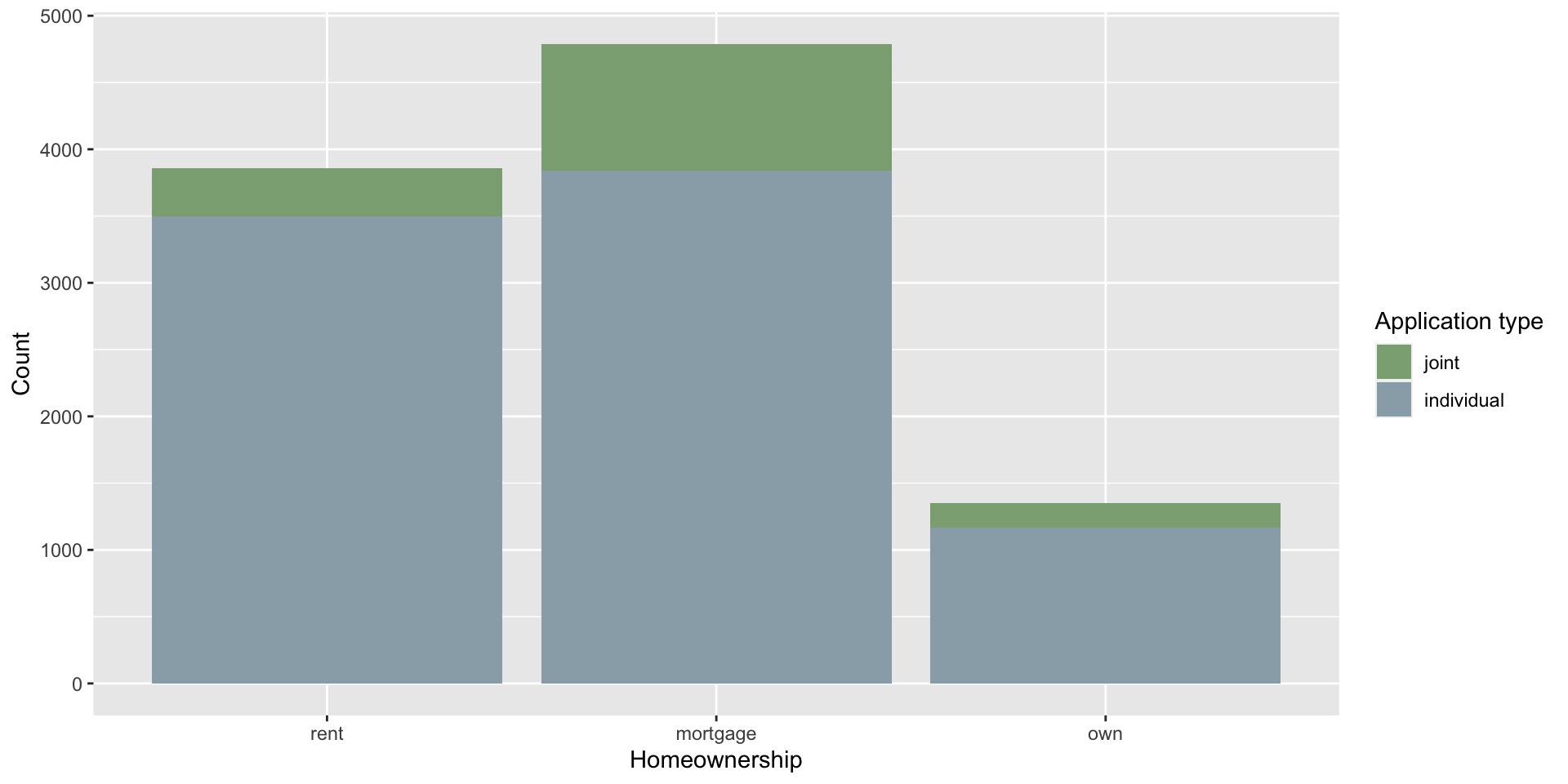
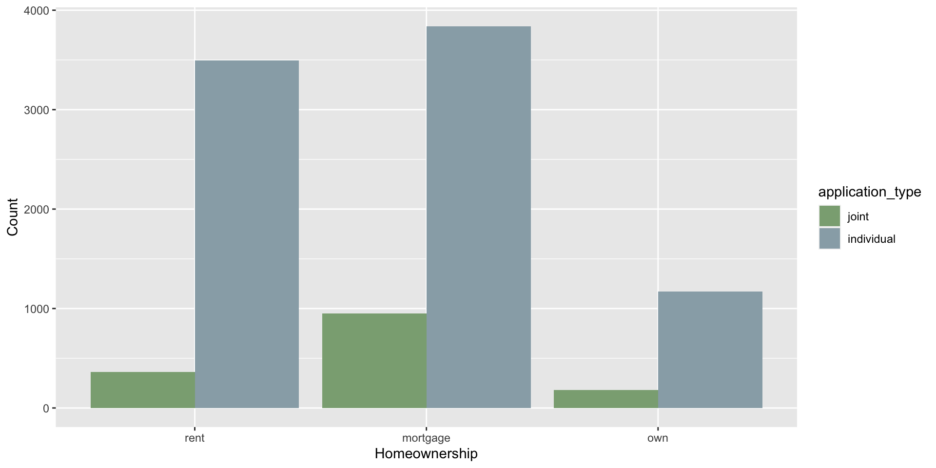
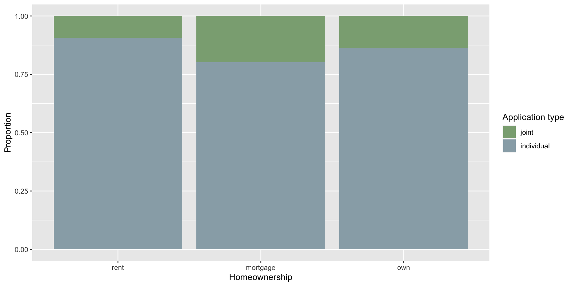
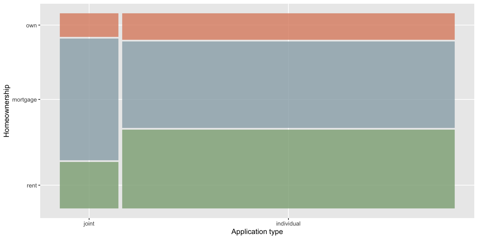
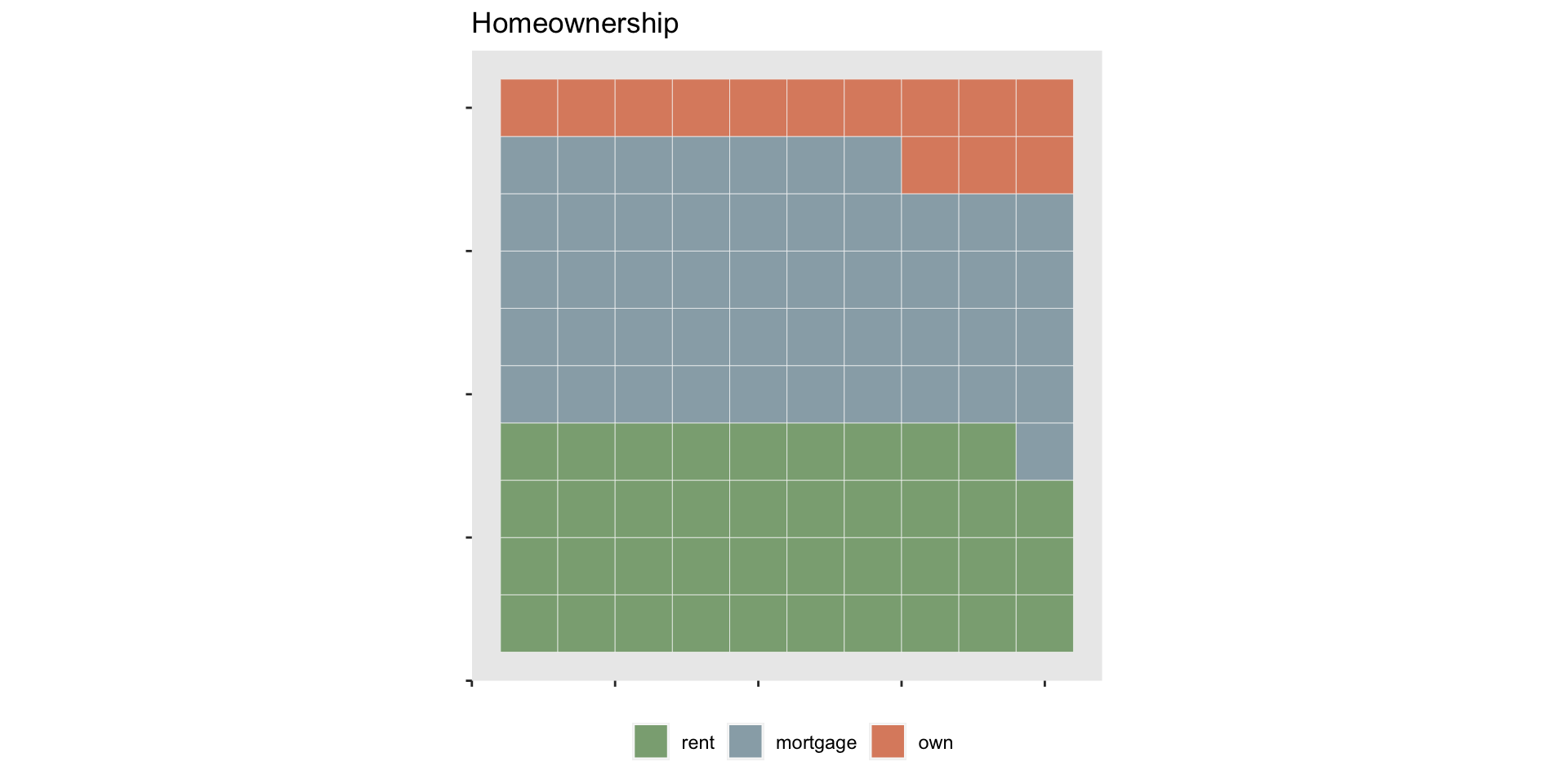
$ homeownership                    <fct> mortgage, rent, rent, rent, rent, own…
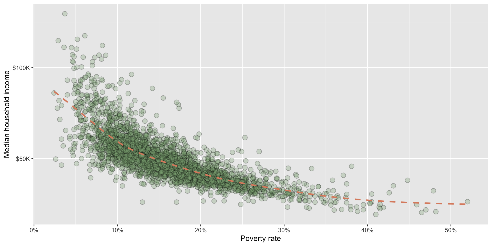
$ annual_income                    <dbl> 90000, 40000, 40000, 30000, 35000, 34…
$ verified_income                  <fct> Verified, Not Verified, Source Verifi…
$ debt_to_income                   <dbl> 18.01, 5.04, 21.15, 10.16, 57.96, 6.4…
$ annual_income_joint              <dbl> NA, NA, NA, NA, 57000, NA, 155000, NA…
$ verification_income_joint        <fct> , , , , Verified, , Not Verified, , ,…
$ debt_to_income_joint             <dbl> NA, NA, NA, NA, 37.66, NA, 13.12, NA,…
$ delinq_2y                        <int> 0, 0, 0, 0, 0, 1, 0, 1, 1, 0, 0, 0, 0…
$ months_since_last_delinq         <int> 38, NA, 28, NA, NA, 3, NA, 19, 18, NA…
$ earliest_credit_line             <dbl> 2001, 1996, 2006, 2007, 2008, 1990, 2…
$ inquiries_last_12m               <int> 6, 1, 4, 0, 7, 6, 1, 1, 3, 0, 4, 4, 8…
$ total_credit_lines               <int> 28, 30, 31, 4, 22, 32, 12, 30, 35, 9,…
$ open_credit_lines                <int> 10, 14, 10, 4, 16, 12, 10, 15, 21, 6,…
$ total_credit_limit               <int> 70795, 28800, 24193, 25400, 69839, 42…
$ total_credit_utilized            <int> 38767, 4321, 16000, 4997, 52722, 3898…
$ num_collections_last_12m         <int> 0, 0, 0, 0, 0, 0, 0, 0, 0, 0, 0, 0, 0…
$ num_historical_failed_to_pay     <int> 0, 1, 0, 1, 0, 0, 0, 0, 0, 0, 1, 0, 0…
$ months_since_90d_late            <int> 38, NA, 28, NA, NA, 60, NA, 71, 18, N…
$ current_accounts_delinq          <int> 0, 0, 0, 0, 0, 0, 0, 0, 0, 0, 0, 0, 0…
$ total_collection_amount_ever     <int> 1250, 0, 432, 0, 0, 0, 0, 0, 0, 0, 0,…
$ current_installment_accounts     <int> 2, 0, 1, 1, 1, 0, 2, 2, 6, 1, 2, 1, 2…
$ accounts_opened_24m              <int> 5, 11, 13, 1, 6, 2, 1, 4, 10, 5, 6, 7…
$ months_since_last_credit_inquiry <int> 5, 8, 7, 15, 4, 5, 9, 7, 4, 17, 3, 4,…
$ num_satisfactory_accounts        <int> 10, 14, 10, 4, 16, 12, 10, 15, 21, 6,…
$ num_accounts_120d_past_due       <int> 0, 0, 0, 0, 0, 0, 0, NA, 0, 0, 0, 0, …
$ num_accounts_30d_past_due        <int> 0, 0, 0, 0, 0, 0, 0, 0, 0, 0, 0, 0, 0…
$ num_active_debit_accounts        <int> 2, 3, 3, 2, 10, 1, 3, 5, 11, 3, 2, 2,…
$ total_debit_limit                <int> 11100, 16500, 4300, 19400, 32700, 272…
$ num_total_cc_accounts            <int> 14, 24, 14, 3, 20, 27, 8, 16, 19, 7, …
$ num_open_cc_accounts             <int> 8, 14, 8, 3, 15, 12, 7, 12, 14, 5, 8,…
$ num_cc_carrying_balance          <int> 6, 4, 6, 2, 13, 5, 6, 10, 14, 3, 5, 3…
$ num_mort_accounts                <int> 1, 0, 0, 0, 0, 3, 2, 7, 2, 0, 2, 3, 3…
$ account_never_delinq_percent     <dbl> 92.9, 100.0, 93.5, 100.0, 100.0, 78.1…
$ tax_liens                        <int> 0, 0, 0, 1, 0, 0, 0, 0, 0, 0, 0, 0, 0…
$ public_record_bankrupt           <int> 0, 1, 0, 0, 0, 0, 0, 0, 0, 0, 1, 0, 0…
$ loan_purpose                     <fct> moving, debt_consolidation, other, de…
$ application_type                 <fct> individual, individual, individual, i…
$ loan_amount                      <int> 28000, 5000, 2000, 21600, 23000, 5000…
$ term                             <dbl> 60, 36, 36, 36, 36, 36, 60, 60, 36, 3…
$ interest_rate                    <dbl> 14.07, 12.61, 17.09, 6.72, 14.07, 6.7…
$ installment                      <dbl> 652.53, 167.54, 71.40, 664.19, 786.87…
$ grade                            <fct> C, C, D, A, C, A, C, B, C, A, C, B, C…
$ sub_grade                        <fct> C3, C1, D1, A3, C3, A3, C2, B5, C2, A…
$ issue_month                      <fct> Mar-2018, Feb-2018, Feb-2018, Jan-201…
$ loan_status                      <fct> Current, Current, Current, Current, C…
$ initial_listing_status           <fct> whole, whole, fractional, whole, whol…
$ disbursement_method              <fct> Cash, Cash, Cash, Cash, Cash, Cash, C…
$ balance                          <dbl> 27015.86, 4651.37, 1824.63, 18853.26,…
$ paid_total                       <dbl> 1999.330, 499.120, 281.800, 3312.890,…
$ paid_principal                   <dbl> 984.14, 348.63, 175.37, 2746.74, 1569…
$ paid_interest                    <dbl> 1015.19, 150.49, 106.43, 566.15, 754.…
$ paid_late_fees                   <dbl> 0, 0, 0, 0, 0, 0, 0, 0, 0, 0, 0, 0, 0…

Scaterplots: County Data

Code
ggplot(county, aes(x = poverty/100, y = median_hh_income)) +
  geom_point(alpha = 0.3, fill = "#8BAB82", 
             shape = 21, size = 3) +
  geom_smooth(linetype = "dashed", color = "#DD8C6E", se = FALSE) +
  labs(x = "Poverty rate",y = "Median household income") +
  scale_x_continuous(labels = percent_format(accuracy = 1)) +
  scale_y_continuous(labels = dollar_format(scale = 0.001, suffix = "K"))

Deviation

We call the distance of an observation from its mean its deviation. Below are the deviations for the \(1^{st},\) \(2^{nd},\) \(3^{rd},\) and \(50^{th}\) observations in the interest_rate variable:

\[ \begin{align} x_1 - \bar{x} &= 10.9 - 11.57 = -0.67 \\ x_2 - \bar{x} &= 9.92 - 11.57 = -1.65 \\ x_3 - \bar{x} &= 26.3 - 11.57 = 14.73 \\ &\vdots \\ x_{50} - \bar{x} &= 6.08 - 11.57 = -5.49 \\ \end{align} \]

Sample variance

If we square these deviations and then take an average, the result is equal to the sample variance, denoted by \(s^2\):

\[ \begin{align} s^2 &= \frac{(-0.67)^2 + (-1.65)^2 + (14.73)^2 + \cdots + (-5.49)^2}{50 - 1} \\ &= \frac{0.45 + 2.72 + \cdots + 30.14}{49} \\ &= 25.52 \end{align} \]

Note(1): We divide by \(n - 1,\) rather than dividing by \(n,\) when computing a sample’s variance.

Note(2): Note that squaring the deviations does two things. First, it makes large values relatively much larger. Second, it gets rid of any negative signs.

Standard Deviation

The sample standard deviation can be calculated as the square root of the sum of the squared distance of each value from the mean divided by the number of observations minus one:

\[s = \sqrt{\frac{\sum_{i=1}^n (x_i - \bar{x})^2}{n-1}}\]

The standard deviation is also defined as the square root of the variance:

\[s = \sqrt{25.52} = 5.05\]

Reminder: Variance and standard deviation

  • The variance is the average squared distance from the mean.
  • The standard deviation is the square root of the variance.
  • The standard deviation is useful when considering how far the data are distributed from the mean.

A Contingency Table

A table that summarizes data for two categorical variables is called a contingency table

Code
result_table <- loans %>%
  count(application_type, homeownership) %>%
  pivot_wider(names_from = homeownership, values_from = n) %>%
  select(application_type, rent, mortgage, own) %>%
  adorn_totals(where = c("row", "col"))

# Print the result_table
styled_table <- kable(result_table, format = "html") %>%
  kable_styling("striped")

print(styled_table)
application_type rent mortgage own Total
joint 362 950 183 1495
individual 3496 3839 1170 8505
Total 3858 4789 1353 10000

Stacked bar plot

Code
p_stacked <- ggplot(loans, aes(x = homeownership, fill = application_type)) +
  geom_bar() +
  labs(x = "Homeownership", y = "Count", fill = "Application type")+
  scale_fill_manual(values = c("#8BAB82", "#98ACB5", "#DD8C6E"))  # Add colors for each application_type

# Print the plot
print(p_stacked)

Dodged bar plot

We can convey the same info in a dodged bar plot

Code
p_dodged <- ggplot(loans, aes(x = homeownership, fill = application_type)) +
  geom_bar(position = "dodge") +  # Use dodge position to separate bars by application_type
  labs(x = "Homeownership", y = "Count")+
  scale_fill_manual(values = c("#8BAB82", "#98ACB5", "#DD8C6E"))  # Add colors for each application_type

# Print the plot
print(p_dodged)

Proportion

Code
p_standardized <- ggplot(loans, aes(x = homeownership, fill = application_type)) +
  geom_bar(position = "fill") +
  scale_fill_manual(values = c("#8BAB82", "#98ACB5", "#DD8C6E")) +
  labs(x = "Homeownership", y = "Proportion", fill = "Application type") 

# Print the plot
print(p_standardized)

Choosing a bar plot

When is the stacked, dodged, or standardized bar plot the most useful?

  • Explanatory vs. response?

  • Space?

  • Balance?

  • Raw totals?

Mosaic Plots

Code
p_mosaic <- ggplot(loans) +
  geom_mosaic(aes(x = product(application_type), fill = homeownership)) +
  scale_fill_manual(values = c("#8BAB82", "#98ACB5", "#DD8C6E")) +
  labs(x = "Application type", y = "Homeownership") +
  guides(fill = FALSE)

print(p_mosaic)

Sleep Mosaic Plot

Pie Charts

Let’s just not

Waffle charts

Code
p_waffle <- loans |>
  count(homeownership) |>
  ggplot(aes(fill = homeownership, values = n)) +
  geom_waffle(colour = "#F8F8F8", flip = TRUE, make_proportional = TRUE, na.rm = TRUE) +
  labs(fill = NULL, title = "Homeownership") +
  scale_fill_manual(values = c("#8BAB82", "#98ACB5", "#DD8C6E")) +
  coord_equal() +
  theme_enhance_waffle() +
  theme(legend.position = "bottom")

print(p_waffle)

Waffle chart

County Example Data

Code
county |>
  select(state, name, pop_change, pop_change_2levels, median_hh_income) |>
  filter(!is.na(pop_change)) |>
  group_by(pop_change_2levels) |> 
  slice_sample(n = 5) |>
  arrange(pop_change_2levels, state, name) |>
  rename(
    State = state,
    County = name,
    `Population change (%)` = pop_change,
    `Gain / No gain` = pop_change_2levels,
    `Median household income` = median_hh_income
  ) |>
  kbl(linesep = "", booktabs = TRUE, align = "llccc") |>
  kable_styling(bootstrap_options = c("striped", "condensed"), 
                latex_options = c("striped", "hold_position"), full_width = FALSE) |>
  column_spec(3, width = "8em") |>
  column_spec(4, width = "4em") |>
  column_spec(5, width = "8em")
The median household income from a random sample of 5 counties with population gain between 2010 to 2017 and another random sample of 5 counties with no population gain.
State County Population change (%) Gain / No gain Median household income
Missouri Dallas County 1.26 gain 41441
Montana McCone County 0.23 gain 46193
Tennessee Grainger County 1.79 gain 40088
Texas Sterling County 5.63 gain 50000
Wyoming Teton County 4.21 gain 80049
Arkansas Franklin County -0.06 no gain 39472
Indiana Sullivan County -1.86 no gain 45031
Iowa Humboldt County -1.06 no gain 48847
Missouri Holt County -3.86 no gain 43981
Virginia Charles City County -0.95 no gain 55069

Side by Side Box Plot

Code
p_box <- county |>
  filter(!is.na(pop_change)) |>
  ggplot(aes(x = median_hh_income, y = pop_change_2levels, color = pop_change_2levels)) +
  geom_boxplot() +
  scale_color_manual(values = c("#8BAB82", "#DD8C6E")) +  # Use scale_color_manual for color
  scale_x_continuous(labels = label_dollar()) +
  labs(x = "Median household income", y = NULL, color = "Change\nin population")

print(p_box)

Ridge Plots

Code
p_ridge <- county |>
  filter(!is.na(pop_change) & !is.na(metro) & !is.na(median_edu) & median_edu != "below_hs") |>
  # for better labeling on plot
  rename(
    pop_change_num = pop_change,
    pop_change = pop_change_2levels
    ) |>
  ggplot(aes(x = median_hh_income, y = median_edu, fill = median_edu, color = median_edu)) +
  geom_density_ridges(alpha = 0.5, aes(linetype = median_edu)) +
  scale_fill_manual(values = c("#8BAB82", "#98ACB5", "#DD8C6E")) +
  scale_color_manual(values = c("#8BAB82", "#98ACB5", "#DD8C6E")) +
  scale_linetype_manual(values = c("solid", "dashed", "dotted")) +
  scale_x_continuous(labels = label_dollar()) +
  facet_grid(pop_change~metro, labeller = label_both) +
  labs(x = "Median household income", y = NULL) +
  guides(fill = FALSE, color = FALSE, linetype = FALSE)

print(p_ridge)

Ridge Plots

Is inflation returning
to normal?

Ridge Plots

Based on the stacked bar plot, do views on the protests and age appear to be associated? Explain your reasoning.

Side Note: Heatmaps

Some possible stories to look for

While doing exploratory analysis, you might be on the lookout for:

  • Factoid stories

  • Interaction stories

  • Comparison stories

  • Change stories

Factoid stories

Why does this one data point stand out from the others?

  • Sometimes in large sets of data you find the most interesting thing is the story of one particular piece of information.

  • This could be an “outlier”, or it could be the data point that is most common.

  • A detail about one particular piece of your data can fascinate and surprise people. It can also give them an easier way to start thinking about the whole set of data.

Interaction stories

Why do these do aspects of the data change with each other?

  • When two aspects of your data seem related (correlated), you can tell a story about how they interact.

  • In other cases, they might interact as opposites.

  • You need to be cautious about whether you will guess about reasons for the interaction, but noticing the relationship itself can be a good story that connects things people otherwise don’t think about together.

Comparison Stories

What is the meaningful difference between these parts?

  • Often one part of your data tells one story, but another part tells a totally different story.
  • Or maybe there is a smaller portion of your data that serves as an example of an overall pattern.

Change stories

What made this part of the data change from this to that?

  • People like to think about how things change over time.

  • Telling a story a story about change over time appeals to people’s interest in understanding what causes change, and they can often remember seeing the differences.

Review

  • Today we covered some basics about exploring data.

  • Most of you have had a fair amount of statistics training so hopefully exploring data and descriptive statistics are familiar.

  • Perhaps what was new was the use of graphical tools to explore data.

  • If you’d like to think more about using visualization as a tool to explore data, I recommend: Nathan Yau, “Data Points

To-Do

Before next class:

When you are finished with each, there will be an option to generate a hash. Generate the hash, copy, and paste here!