Graphic design and storytelling principles

Dr. Nathaniel Cline

Warm-Up Exercise


Pair up with someone to discuss your visualization.

  • introduce yourselves

  • describe what you chose for your visualization (what is the data, form of presentation, and main story)

  • focus on whether it is effective or not using Cairo and Healey

  • After 5 min, switch

UNData Exercise


  • What was your initial response?


  • What did you find challenging/easy?


  • What would you need to be able to tell a story from these graphs? What kinds of things might you want to watch out as you think about turning these graphs into a story?

Agenda

1

Storytelling Principles

2

Graphic design and CRAP

3

Review and to do


Sometimes reality is too complex. Stories give it form.
-Jean-Luc Godard


Borges said there are only four stories to tell: a love story between two people, a love story between three people, the struggle for power and the voyage. All of us writers rewrite these same stories ad infinitum.
-Paulo Coelho

Context


  • We need to understand our audience, and in particular their existing narratives

  • How do they percieve you?

  • What do you want your audience to know or do?

  • Will data help?

Dykes’ audience considerations


  1. Key goals and priorities

  2. Beliefs and preferences

  3. Specific expectations

  4. Opportune timing

  5. Topic familiarity

  6. Data literacy

  7. Seniority level

  8. Audience mix

The Nussbaumer approach


  • three minute story


  • big idea


  • storyboarding

Dykes 3 Essential Elements


  • data


  • narrative


  • visuals

When does storytelling make sense?


  • informative vs. insightful

  • exploratory vs. explanatory

  • abstract vs. concrete

  • continuous vs. finite

  • automated vs. curated

Dyke’s 6 elements

  • Data foundation

  • Main point

  • Explanatory focus

  • Linear sequence

  • Dramatic elements

  • Visual anchors

Remix exercise

  1. audience

  2. big idea

  3. storyboard

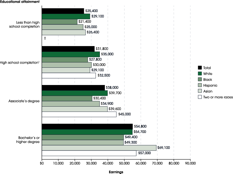
National Center for Education Statistics, 2019

CRAP

Use these principles as a checklist when creating and critiquing designed objects:

  • Contrast

  • Repitition

  • Alignment

  • Proximity

Contrast

If two items are not exactly
the same, make them different.
Really different.

Contrasting font type families

Serif + Sans serif Script + Serif Slab + Sans serif etc.


Serif Sphinx of black quartz, judge my vow
Sans serif Sphinx of black quartz, judge my vow
Slab serif Sphinx of black quartz, judge my vow
Script Sphinx of black quartz, judge my vow
Monospaced Sphinx of black quartz, judge my vow

Contrast within family

Here’s a heading

Lorem ipsum dolor sit amet, consectetur adipisicing elit, sed do eiusmod tempor incididunt ut labore et dolore magna aliqua.


Here’s a heading

Lorem ipsum dolor sit amet, consectetur adipisicing elit, sed do eiusmod tempor incididunt ut labore et dolore magna aliqua.

Color contrast

Triad

Monochromatic

Complementary

Complementary Split

Repetition

Repeat some aspect of the design throughout the entire piece

  • colors

  • font

  • graphical elements

  • alignments

Alignment

Every item should have a visual connection with something else on the page.

  • Share lines and repeat alignments where possible.

  • Center + left is super common, but has weak contrast

  • Mixing left and right alignment provides stronger contrast

Proximity

  • Group related items together.

  • Use white space, color, location, contrast, repetition, alignment, etc. to make visually distinct groupings

Review

1

Storytelling Principles

2

Graphic design and CRAP

To-do

1

Read

Burghart, B. “What I’ve Learned from Two Years Collecting Data on Police Killings.” Gawker, August 2014.

The Dollar and Cents Case Against Hollywood’s Exclusion of Women FiveThirtyEight, April 2014.

Ch. 4, ““What Gets Counted Counts” in: D’ignazio, C., & Klein, L. F. (2020). Data feminism. MIT press.

2

Do

Chillllllll