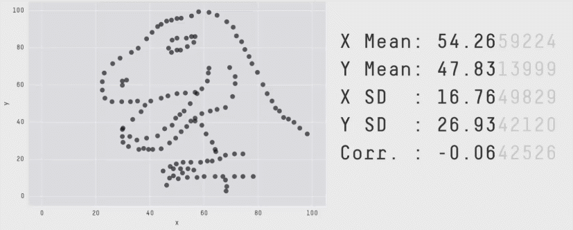
# A tibble: 10 × 2
       x     y
   <dbl> <dbl>
 1  55.4  97.2
 2  51.5  96.0
 3  46.2  94.5
 4  42.8  91.4
 5  40.8  88.3
 6  38.7  84.9
 7  35.6  79.9
 8  33.1  77.6
 9  29.0  74.5
10 26.2 71.4Data Story Principles and Examples
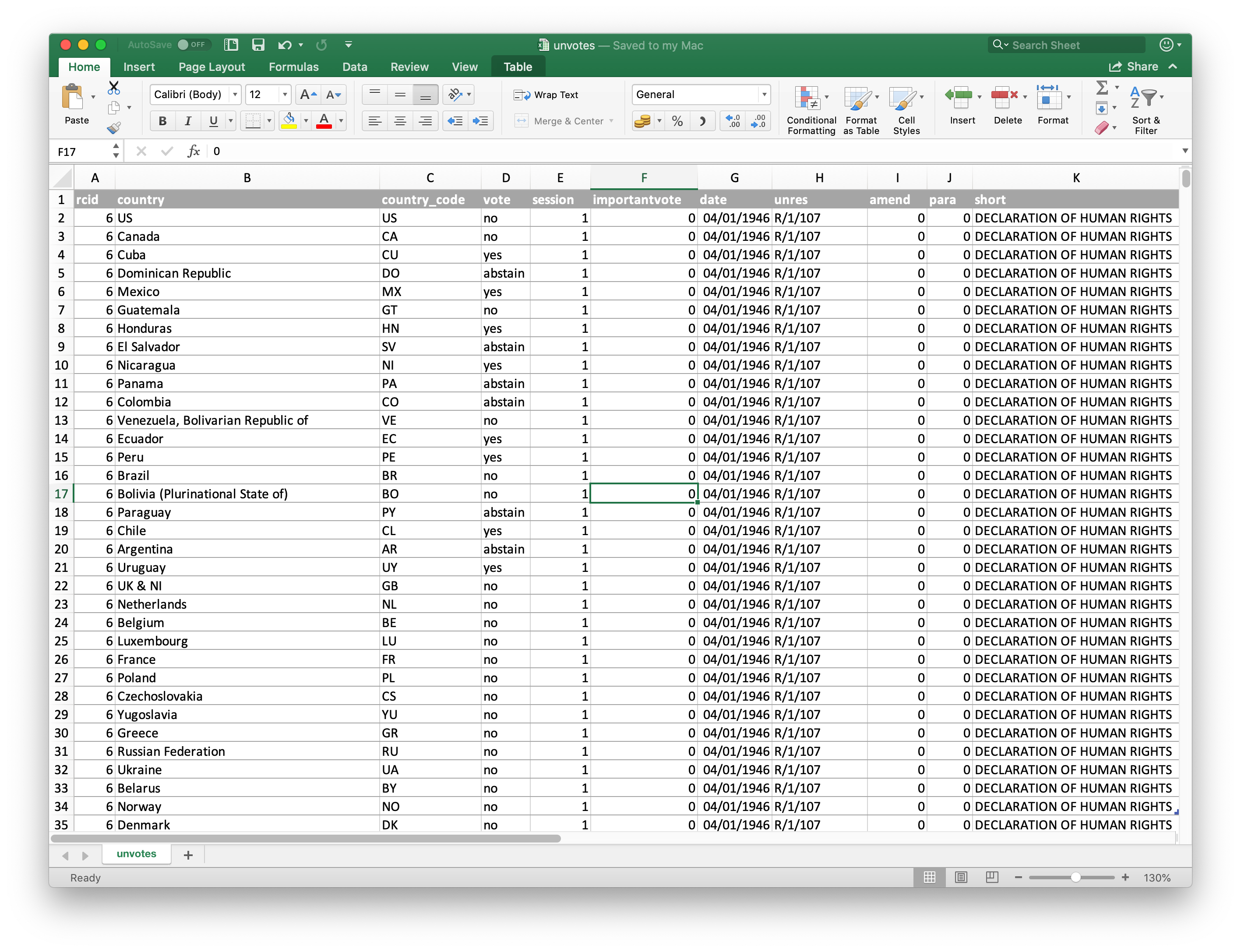
Excel
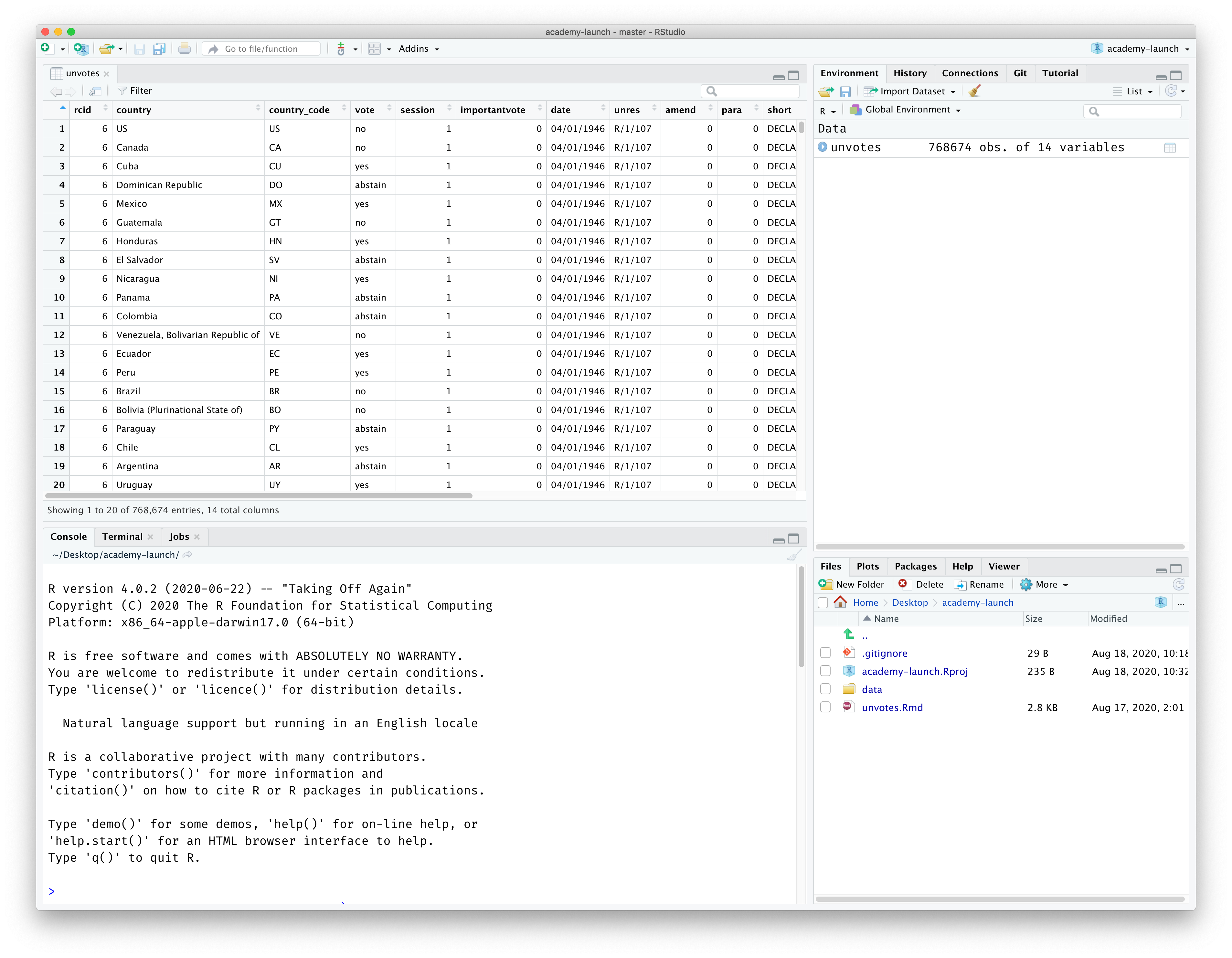
Rstudio environment
Markdown
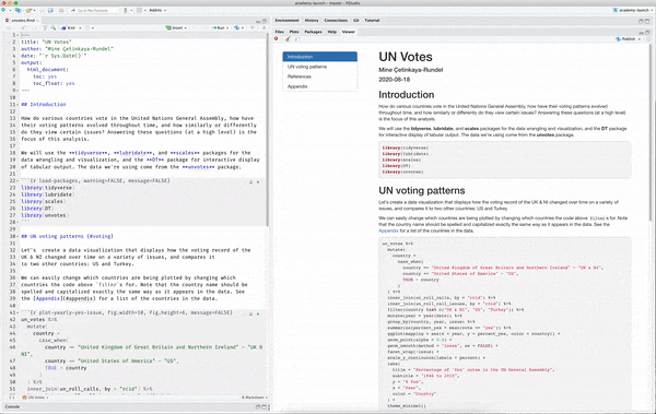
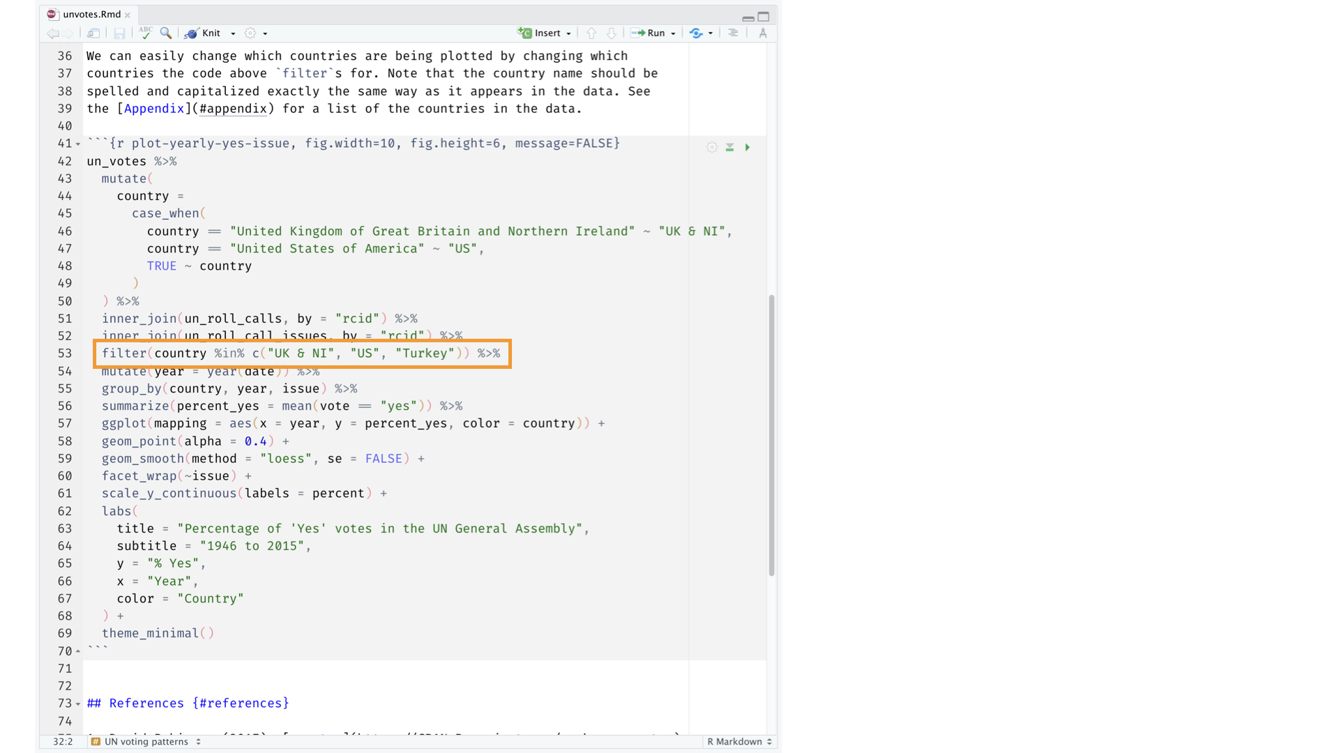
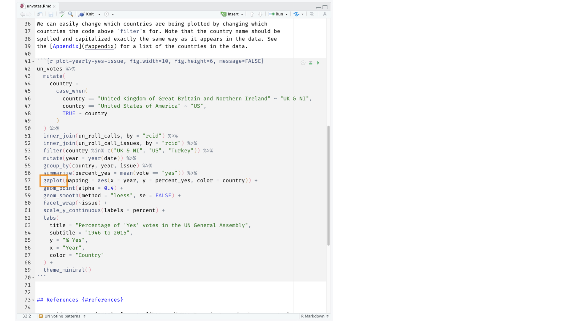
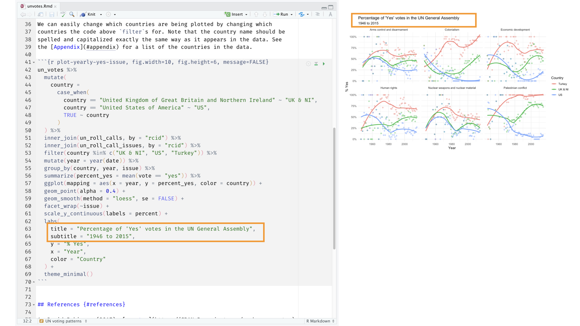
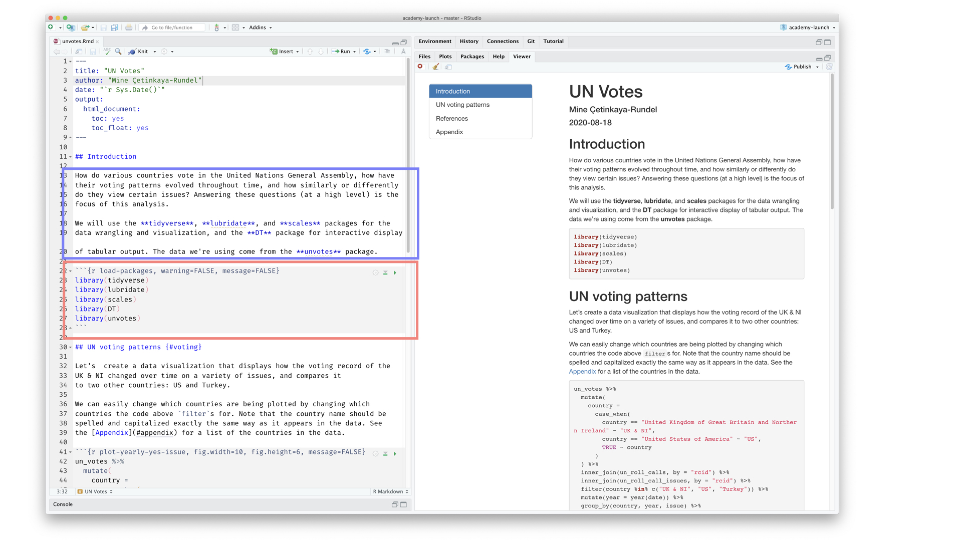
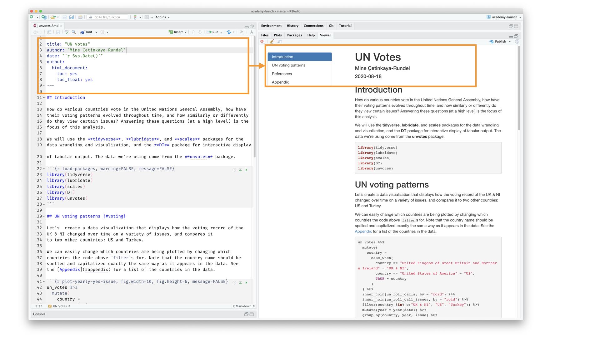
UNVotes Visualized
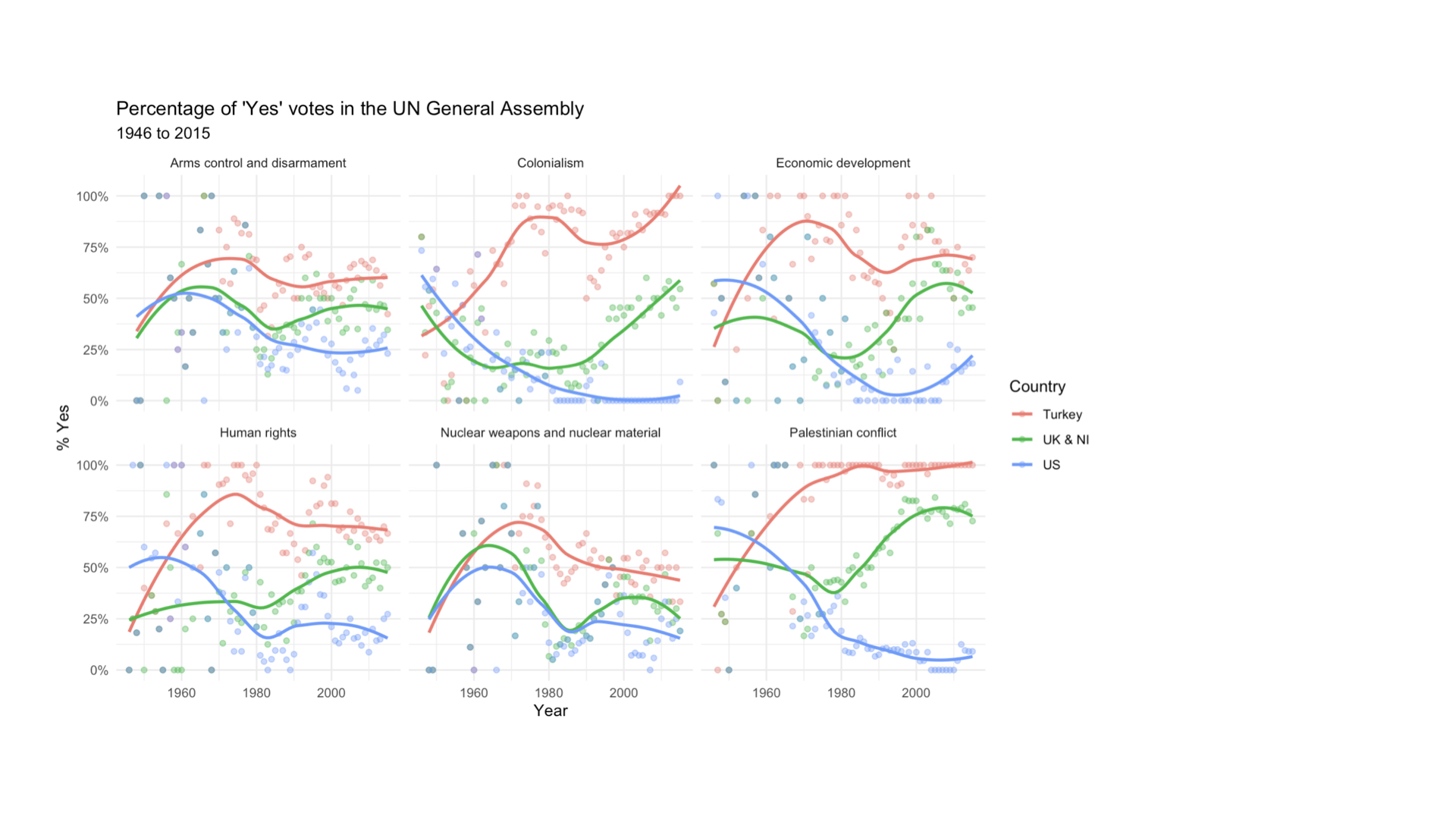
UNVotes Visualized
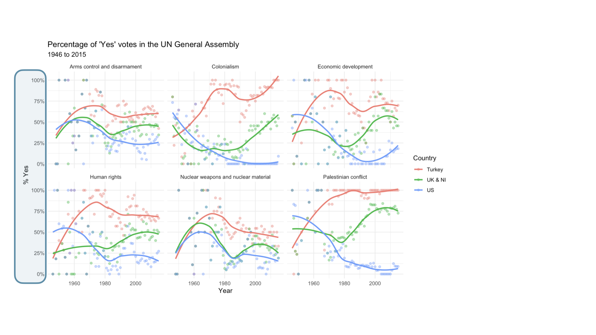
UNVotes Visualized
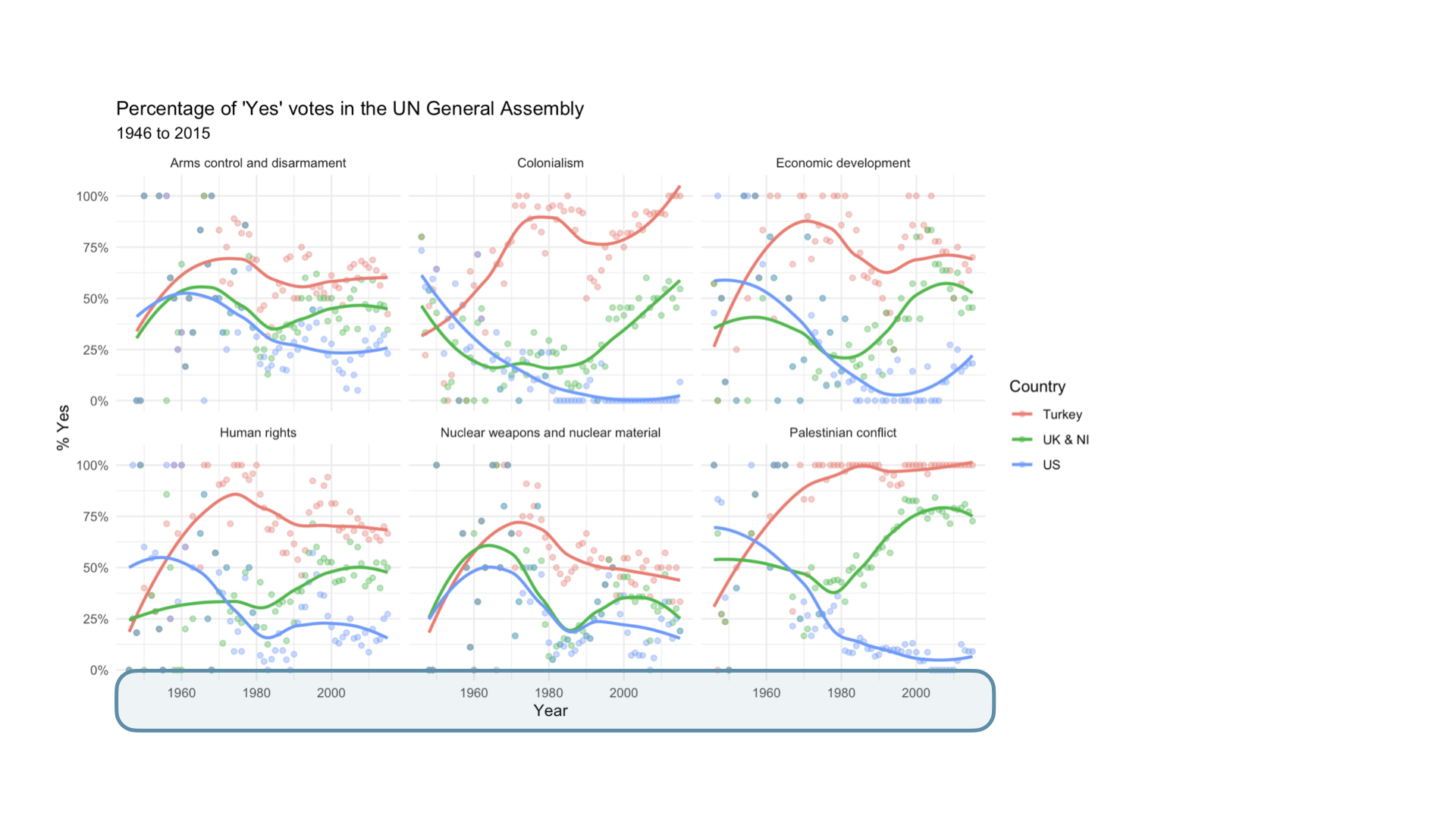
UNVotes Visualized
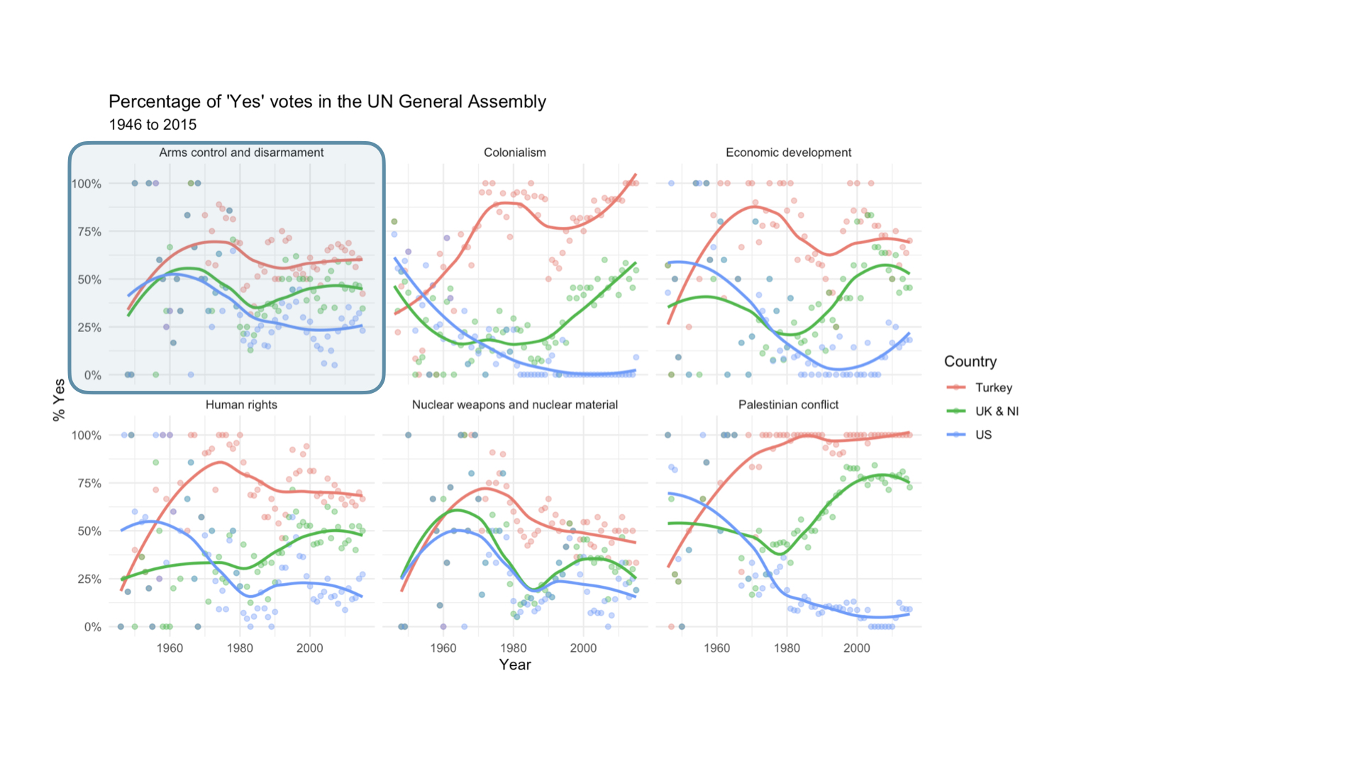
UNVotes Visualized
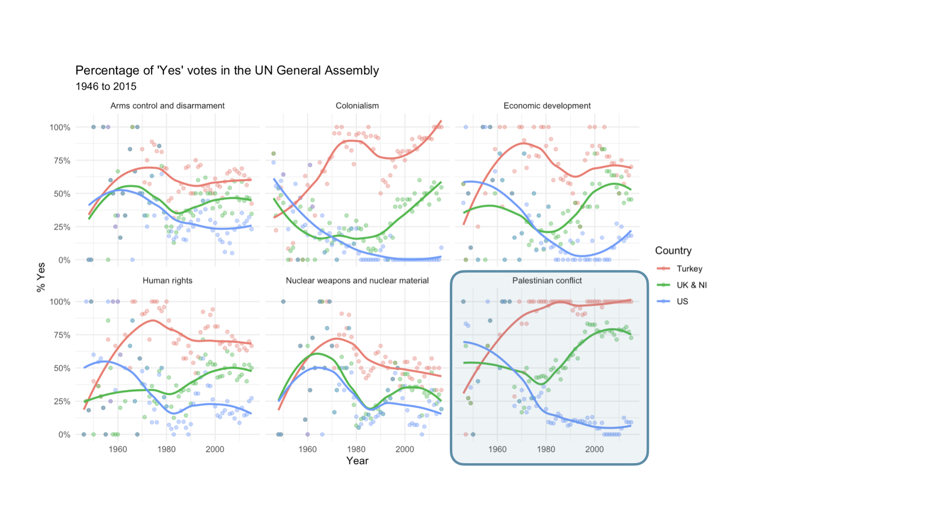
UNVotes Visualized
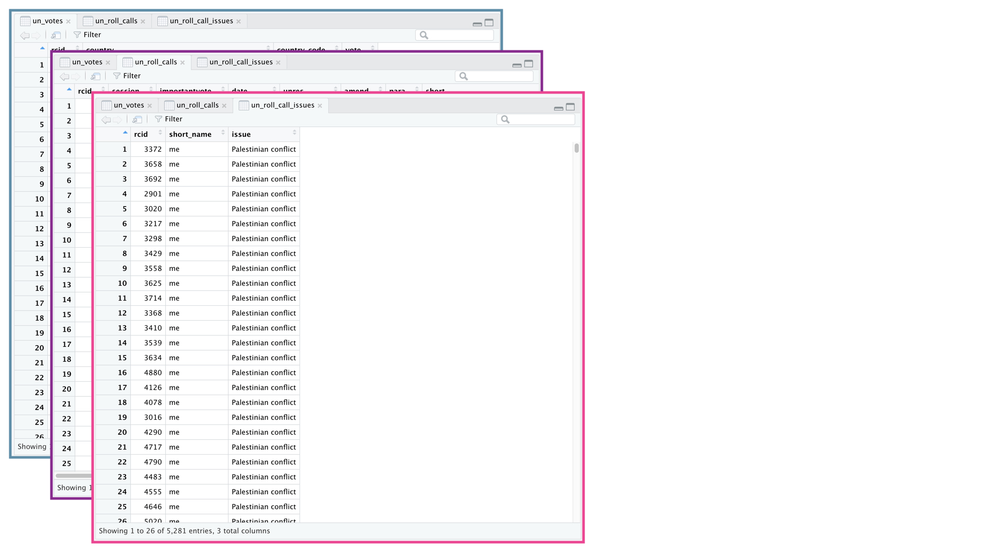
UNVotes Visualized
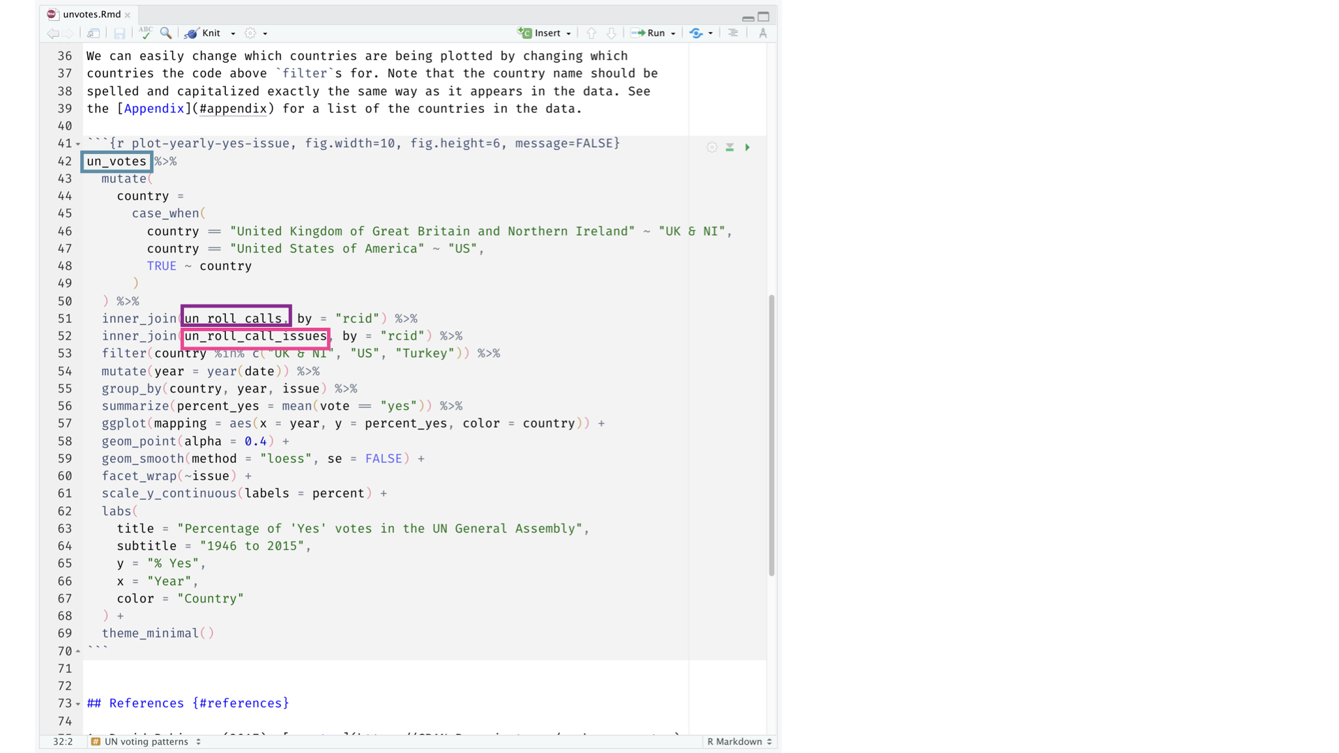
UNVotes Visualized
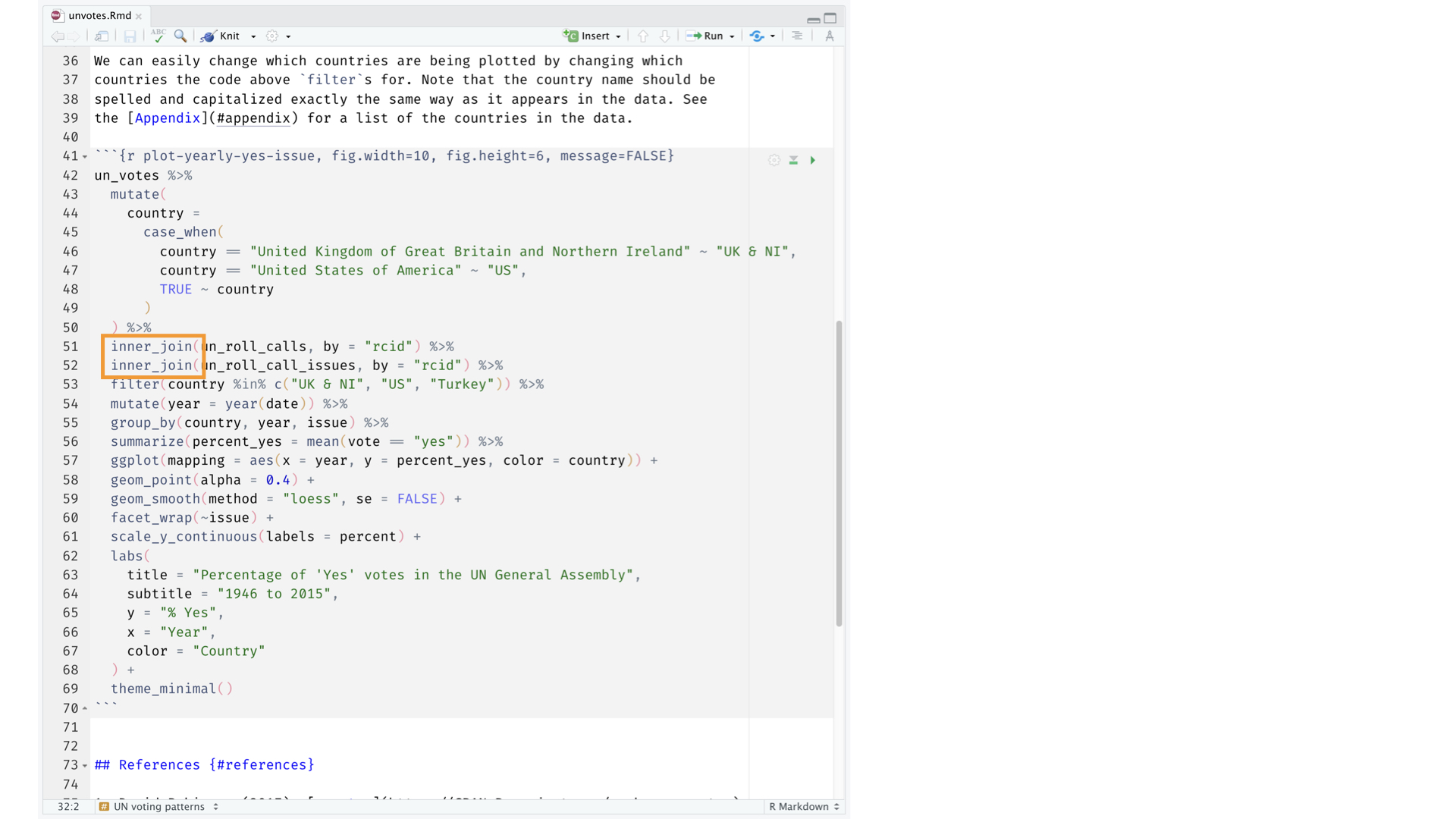
UNVotes Visualized
UNVotes Visualized
UNVotes Visualized
UNVotes Visualized
UNVotes Visualized
Class Critique

Class Critique

Class Critique

oh no
To do
1
Read
Chapter 4 in Fundamentals of Data Visualization (Wilke 2018)
Summary of CRAP graphic design principles from Presentation Zen (Reynolds 2008)
Chapter 4 in Effective Data Storytelling (Dykes 2020)
2
Do
UNdata exercise