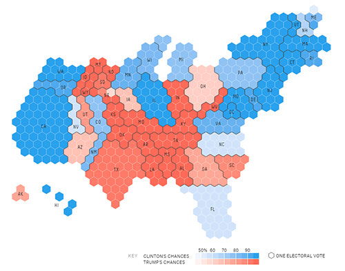
Imagine that you manage an information technology (IT) team. Your team receives tickets, or technical issues, from employees. In the past year, you’ve had a couple of people leave and decided at the time not to replace them. You have heard a rumbling of com- plaints from the remaining employees about having to “pick up the slack.” You’ve just been asked about your hiring needs for the coming year and are wondering if you should hire a couple more people.
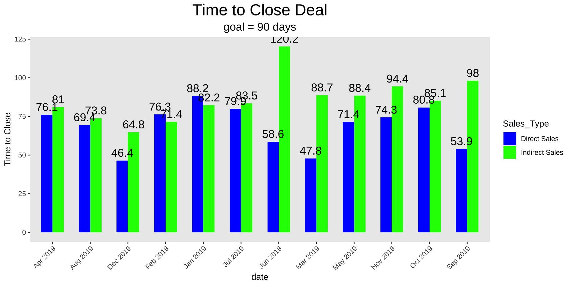
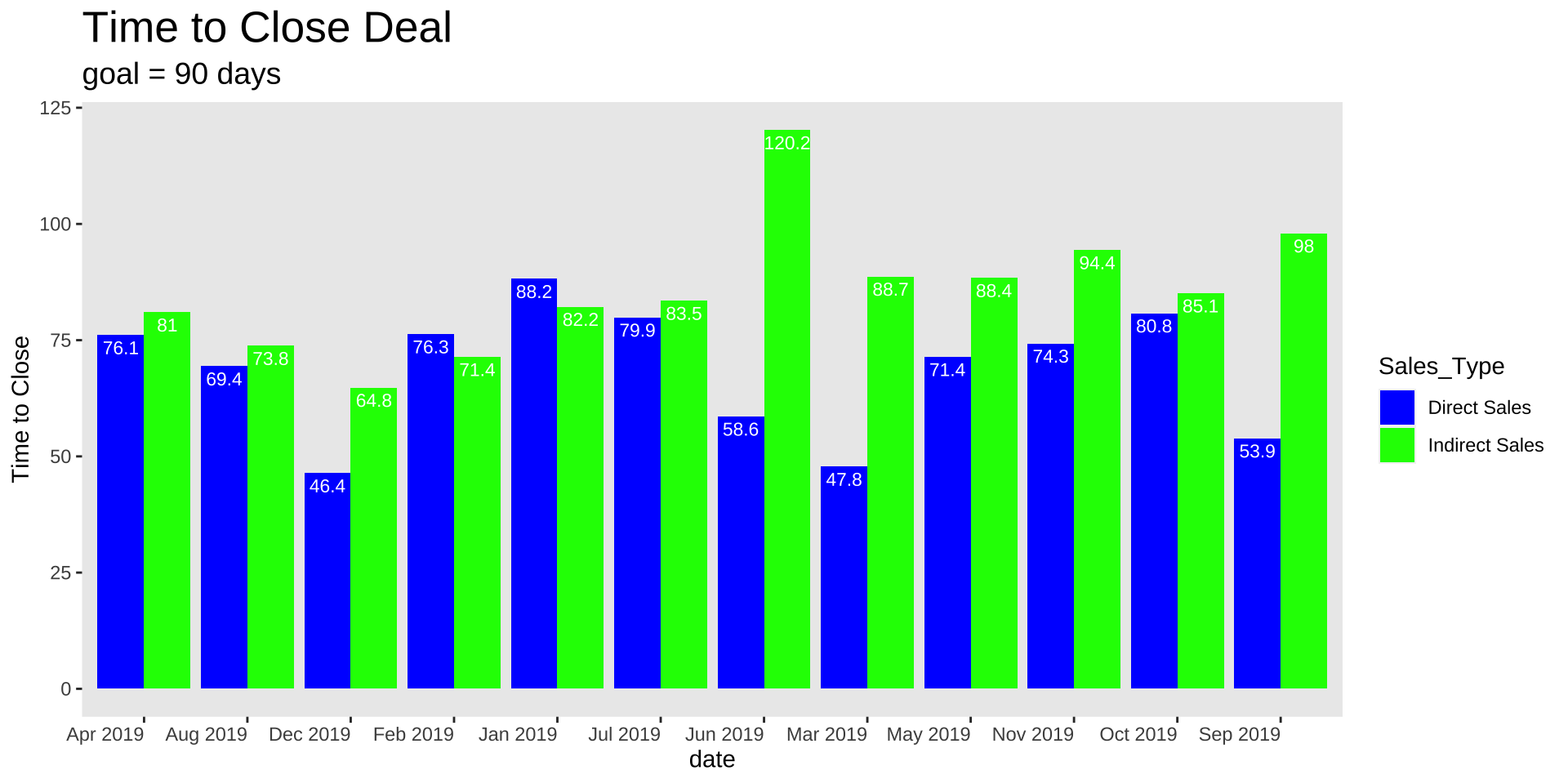
Fixing the first draft
Remove chart border
Remove gridlines
Remove data markers
Clean up axis labels
Label data directly
Leverage consistent color
Decluttering in R
Code
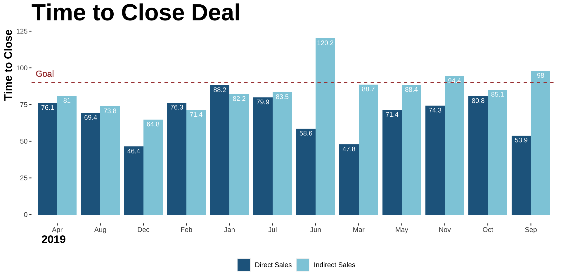
ggplot(data_long, aes(x = MonthYear, y = time_close, fill = Sales_Type)) +geom_bar(stat ="identity", position =position_dodge(width =0.6), width = .6) +geom_text(aes(label = time_close), vjust =-0.5, size =5, position =position_dodge(width =0.6)) +labs(x ="date", y ="Time to Close") +ggtitle("Time to Close Deal") +labs(subtitle ="goal = 90 days") +# Add the subtitle herescale_fill_manual(values =c("Direct Sales"="blue", "Indirect Sales"="green")) +theme(axis.text.x =element_text(angle =45, hjust =1), plot.title =element_text(size =20, hjust =0.5),plot.subtitle =element_text(size =14, hjust =0.5))
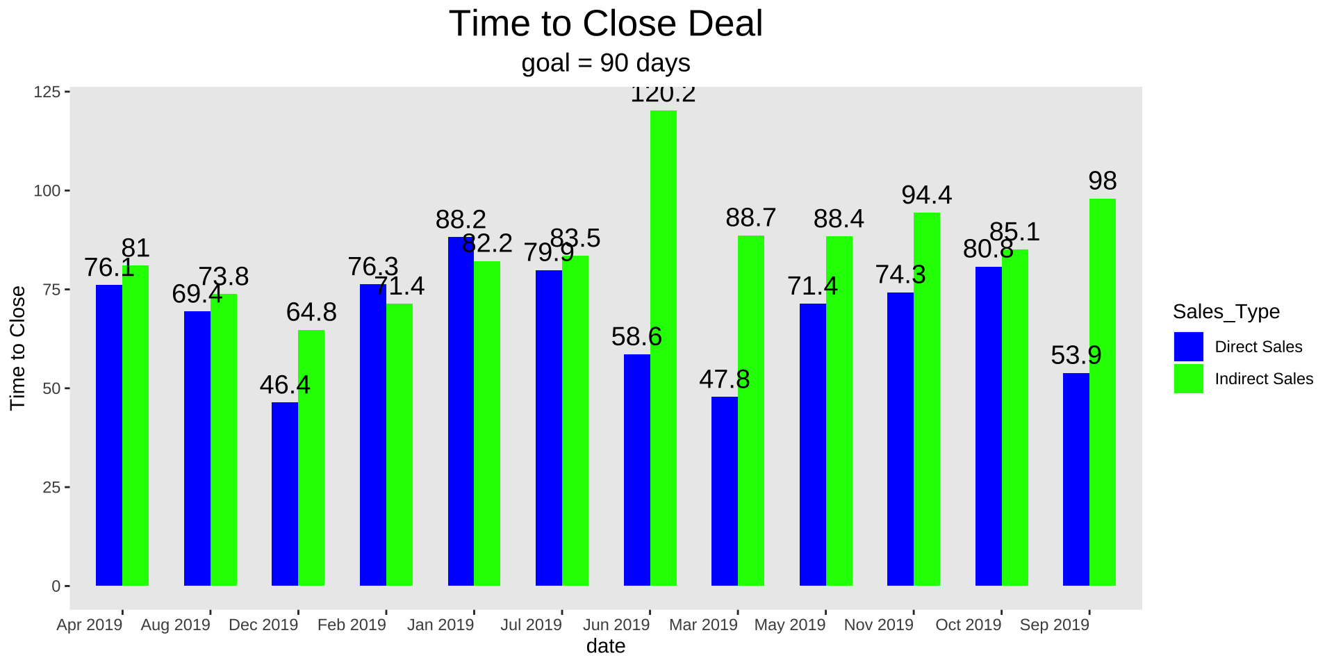
How can we reduce clutter in R?
only way to learn how to mess with the elements of the graph is to look at the ggplot cheatsheet and google and practice
I will walk through how I would do it
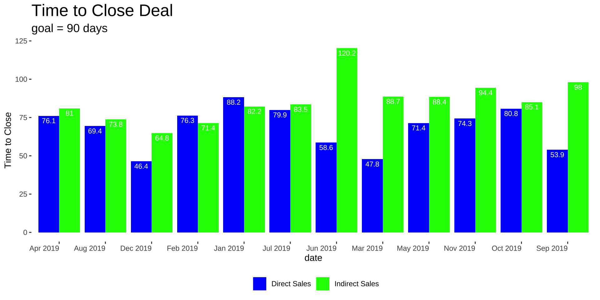
Remove Grid Lines
Code
ggplot(data_long, aes(x = MonthYear, y = time_close, fill = Sales_Type)) +geom_bar(stat ="identity", position =position_dodge(width =0.6), width = .6) +geom_text(aes(label = time_close), vjust =-0.5, size =5, position =position_dodge(width =0.6)) +labs(x ="date", y ="Time to Close") +ggtitle("Time to Close Deal") +labs(subtitle ="goal = 90 days") +# Add the subtitle herescale_fill_manual(values =c("Direct Sales"="blue", "Indirect Sales"="green")) +theme(axis.text.x =element_text(angle =45, hjust =1), plot.title =element_text(size =20, hjust =0.5),plot.subtitle =element_text(size =14, hjust =0.5),panel.grid =element_blank())
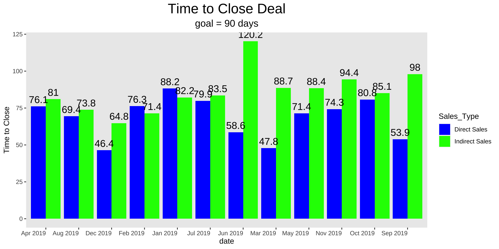
Get rid of 45-degree labels
Code
ggplot(data_long, aes(x = MonthYear, y = time_close, fill = Sales_Type)) +geom_bar(stat ="identity", position =position_dodge(width =0.6), width = .6) +geom_text(aes(label = time_close), vjust =-0.5, size =5, position =position_dodge(width =0.6)) +labs(x ="date", y ="Time to Close") +ggtitle("Time to Close Deal") +labs(subtitle ="goal = 90 days") +# Add the subtitle herescale_fill_manual(values =c("Direct Sales"="blue", "Indirect Sales"="green")) +theme(axis.text.x =element_text(angle =0, hjust =1), plot.title =element_text(size =20, hjust =0.5),plot.subtitle =element_text(size =14, hjust =0.5),panel.grid =element_blank())
Thicken bars
Code
ggplot(data_long, aes(x = MonthYear, y = time_close, fill = Sales_Type)) +geom_bar(stat ="identity", position =position_dodge(width =0.9), width = .9) +geom_text(aes(label = time_close), vjust =-0.5, size =5, position =position_dodge(width =0.9)) +labs(x ="date", y ="Time to Close") +ggtitle("Time to Close Deal") +labs(subtitle ="goal = 90 days") +# Add the subtitle herescale_fill_manual(values =c("Direct Sales"="blue", "Indirect Sales"="green")) +theme(axis.text.x =element_text(angle =0, hjust =1), plot.title =element_text(size =20, hjust =0.5),plot.subtitle =element_text(size =14, hjust =0.5),panel.grid =element_blank())
Put labels in bars
Code
ggplot(data_long, aes(x = MonthYear, y = time_close, fill = Sales_Type)) +geom_bar(stat ="identity", position =position_dodge(width =0.9), width = .9) +geom_text(aes(label = time_close), color ="white", vjust =1.5, size =3, position =position_dodge(width =0.9)) +labs(x ="date", y ="Time to Close") +ggtitle("Time to Close Deal") +labs(subtitle ="goal = 90 days") +# Add the subtitle herescale_fill_manual(values =c("Direct Sales"="blue", "Indirect Sales"="green")) +theme(axis.text.x =element_text(angle =0, hjust =1), plot.title =element_text(size =20, hjust =0.5),plot.subtitle =element_text(size =14, hjust =0.5),panel.grid =element_blank())
Move title over
Code
ggplot(data_long, aes(x = MonthYear, y = time_close, fill = Sales_Type)) +geom_bar(stat ="identity", position =position_dodge(width =0.9), width = .9) +geom_text(aes(label = time_close), color ="white", vjust =1.5, size =3, position =position_dodge(width =0.9)) +labs(x ="date", y ="Time to Close") +ggtitle("Time to Close Deal") +labs(subtitle ="goal = 90 days") +# Add the subtitle herescale_fill_manual(values =c("Direct Sales"="blue", "Indirect Sales"="green")) +theme(axis.text.x =element_text(angle =0, hjust =1), plot.title =element_text(size =20, hjust =0),plot.subtitle =element_text(size =14, hjust =0),panel.grid =element_blank())
Make panel transparent and put legend on bottom?
Code
ggplot(data_long, aes(x = MonthYear, y = time_close, fill = Sales_Type)) +geom_bar(stat ="identity", position =position_dodge(width =0.9), width = .9) +geom_text(aes(label = time_close), color ="white", vjust =1.5, size =3, position =position_dodge(width =0.9)) +labs(x ="date", y ="Time to Close") +ggtitle("Time to Close Deal") +labs(subtitle ="goal = 90 days") +# Add the subtitle herescale_fill_manual(values =c("Direct Sales"="blue", "Indirect Sales"="green")) +theme(axis.text.x =element_text(angle =0, hjust =1), plot.title =element_text(size =20, hjust =0),plot.subtitle =element_text(size =14, hjust =0),panel.grid =element_blank(),panel.background =element_blank(),plot.background =element_blank(),legend.position ="bottom", legend.box ="horizontal" )
Remove legend title
Code
ggplot(data_long, aes(x = MonthYear, y = time_close, fill = Sales_Type)) +geom_bar(stat ="identity", position =position_dodge(width =0.9), width = .9) +geom_text(aes(label = time_close), color ="white", vjust =1.5, size =3, position =position_dodge(width =0.9)) +labs(x ="date", y ="Time to Close") +ggtitle("Time to Close Deal") +labs(subtitle ="goal = 90 days", fill ="") +# Add the subtitle herescale_fill_manual(values =c("Direct Sales"="blue", "Indirect Sales"="green")) +theme(axis.text.x =element_text(angle =0, hjust =1), plot.title =element_text(size =20, hjust =0),plot.subtitle =element_text(size =14, hjust =0),panel.grid =element_blank(),panel.background =element_blank(),plot.background =element_blank(),legend.position ="bottom", legend.box ="horizontal" )
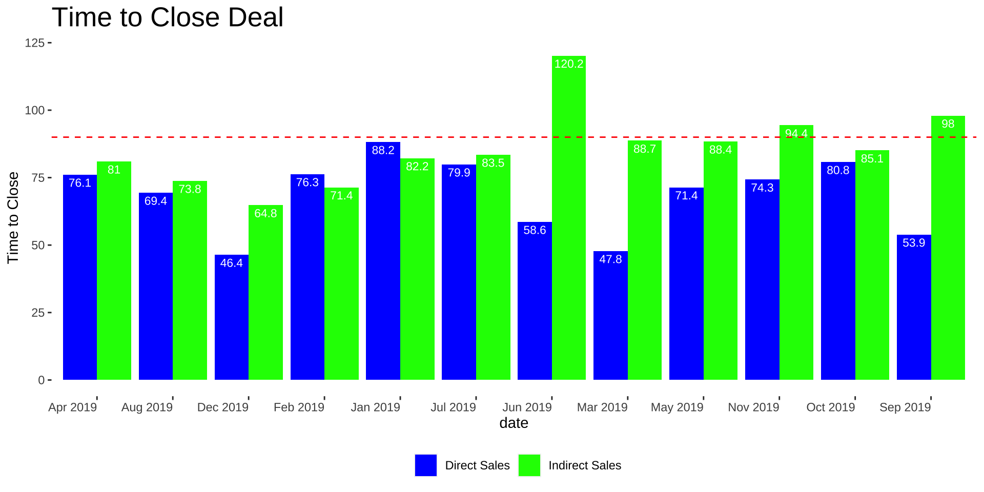
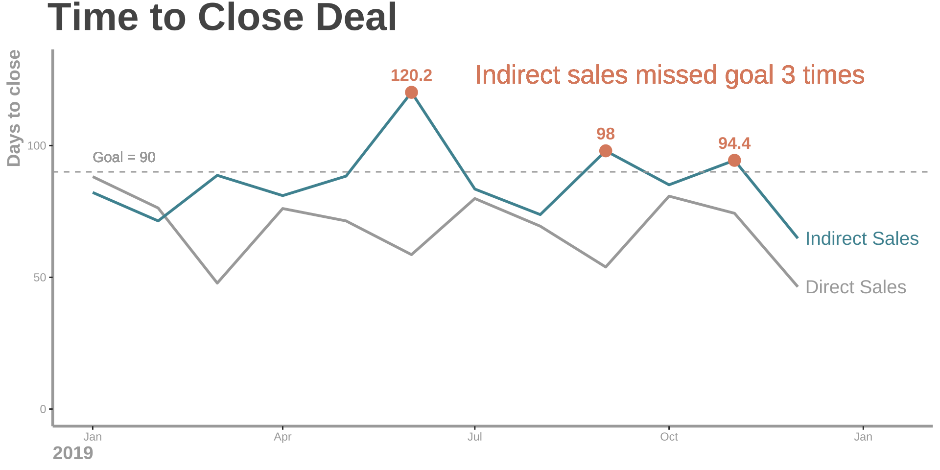
Add goal and remove subtitle
Code
ggplot(data_long, aes(x = MonthYear, y = time_close, fill = Sales_Type)) +geom_bar(stat ="identity", position =position_dodge(width =0.9), width = .9) +geom_text(aes(label = time_close), color ="white", vjust =1.5, size =3, position =position_dodge(width =0.9)) +labs(x ="date", y ="Time to Close") +ggtitle("Time to Close Deal") +labs(fill ="") +# Add the subtitle herescale_fill_manual(values =c("Direct Sales"="blue", "Indirect Sales"="green")) +theme(axis.text.x =element_text(angle =0, hjust =1), plot.title =element_text(size =20, hjust =0),plot.subtitle =element_text(size =14, hjust =0),panel.grid =element_blank(),panel.background =element_blank(),plot.background =element_blank(),legend.position ="bottom", legend.box ="horizontal" ) +geom_hline(yintercept =90, linetype ="dashed", color ="red") +geom_text(aes(x =Inf, y =90, label ="goal"), hjust =0, vjust =-1, color ="red")
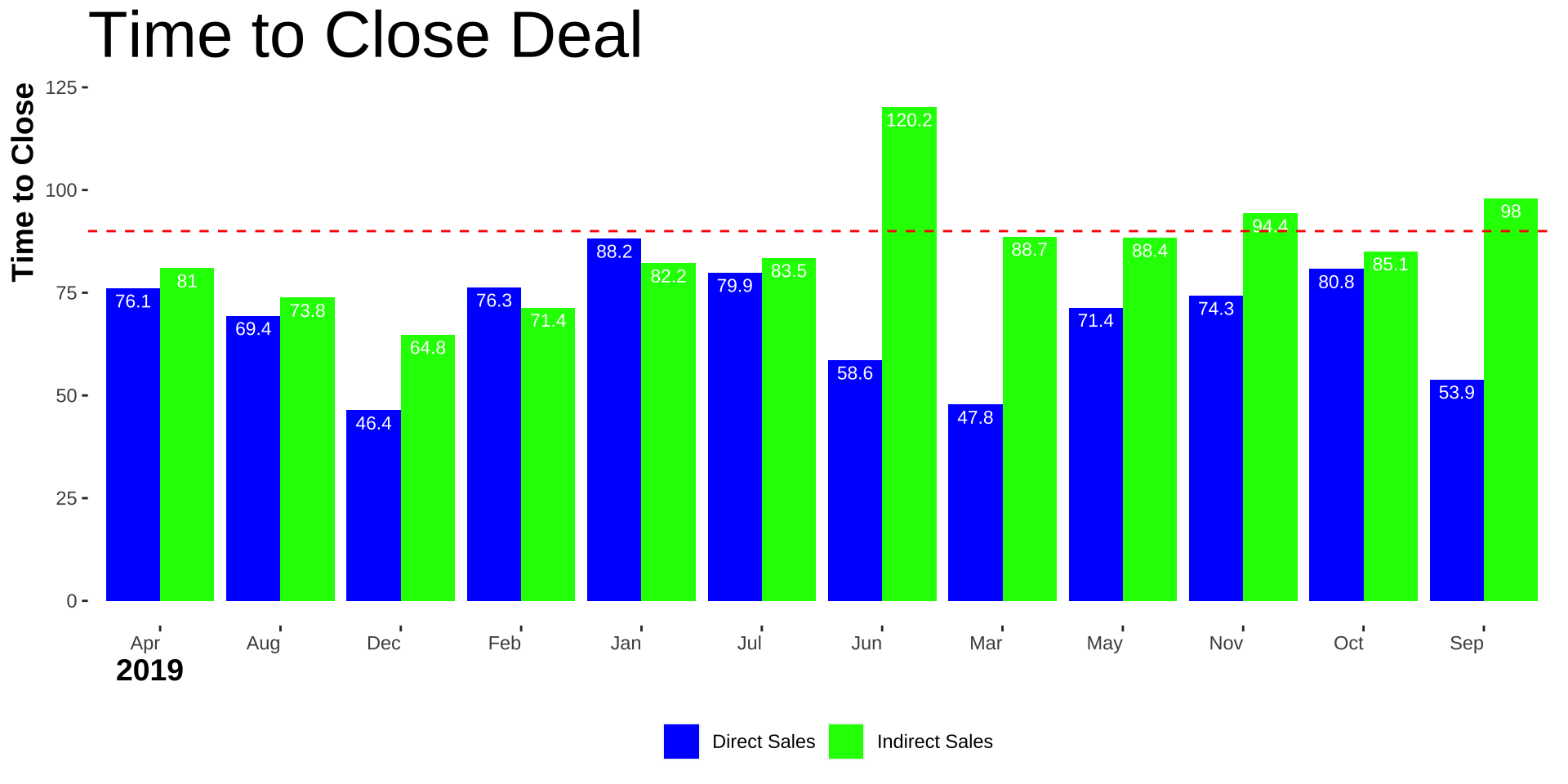
Alter axis labels and titles
Code
data_long$Month <-str_remove(data_long$MonthYear, "\\s\\d{4}$") # Remove the year partggplot(data_long, aes(x = Month, y = time_close, fill = Sales_Type)) +geom_bar(stat ="identity", position =position_dodge(width =0.9), width = .9) +geom_text(aes(label = time_close), color ="white", vjust =1.5, size =3, position =position_dodge(width =0.9)) +labs(x ="2019", y ="Time to Close") +ggtitle("Time to Close Deal") +labs(fill ="") +# Add the subtitle herescale_fill_manual(values =c("Direct Sales"="blue", "Indirect Sales"="green")) +theme(axis.text.x =element_text(angle =0, hjust =1), axis.title.x =element_text(size =14, hjust =0.02, face ="bold"),axis.title.y =element_text(size =14, hjust =1, face ="bold"),plot.title =element_text(size =30, hjust =0),plot.subtitle =element_text(size =14, hjust =0),panel.grid =element_blank(),panel.background =element_blank(),plot.background =element_blank(),legend.position ="bottom", legend.box ="horizontal" ) +geom_hline(yintercept =90, linetype ="dashed", color ="red") +geom_text(aes(x =Inf, y =90, label ="goal"), hjust =0, vjust =-1, color ="red")
Ok the colors are killing me
Code
ggplot(data_long, aes(x = Month, y = time_close, fill = Sales_Type)) +geom_bar(stat ="identity", position =position_dodge(width =0.9), width = .9) +geom_text(aes(label = time_close), color ="white", vjust =1.5, size =3, position =position_dodge(width =0.9)) +labs(x ="2019", y ="Time to Close") +ggtitle("Time to Close Deal") +labs(fill ="") +# Add the subtitle herescale_fill_manual(values =c("Direct Sales"="#22668D", "Indirect Sales"="#8ECDDD")) +theme(axis.text.x =element_text(angle =0, hjust =0.5), axis.title.x =element_text(size =14, hjust =0.02, face ="bold"),axis.title.y =element_text(size =14, hjust =1, face ="bold"),plot.title =element_text(size =30, hjust =0, face ="bold"),plot.subtitle =element_text(size =14, hjust =0),panel.grid =element_blank(),panel.background =element_blank(),plot.background =element_blank(),legend.position ="bottom", legend.box ="horizontal" ) +geom_hline(yintercept =90, linetype ="dashed", color ="#A94442") +geom_text(aes(x = .5, y =90, label ="Goal"), hjust =0, vjust =-1, color ="#A94442")
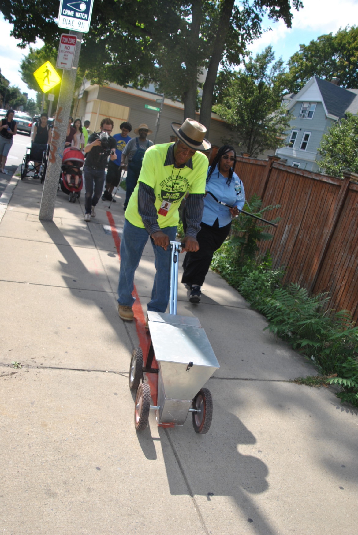
- "A lot of times we’ll just use numbers to talk about this idea of mass incarceration,” Begley says, “and I thought that there maybe was something powerful about using no numbers, no words and just having the images.”
Creative mapping
“Part performance art, part public education, the Arts Committee of City Life/Vida Urbana literally drew a line down Washington Street Saturday afternoon to show what housing discrimination looks like.
Drawing on the 1934 policy of the Federal Housing Administration not to underwrite mortgages in areas they determined were poor risks, CL/VU recreated the red line that the FHA drew in residential areas marking the boundaries of where they would not grant housing mortgages.”
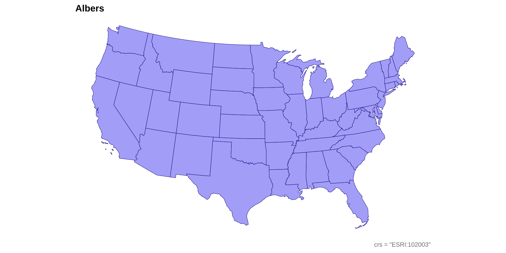
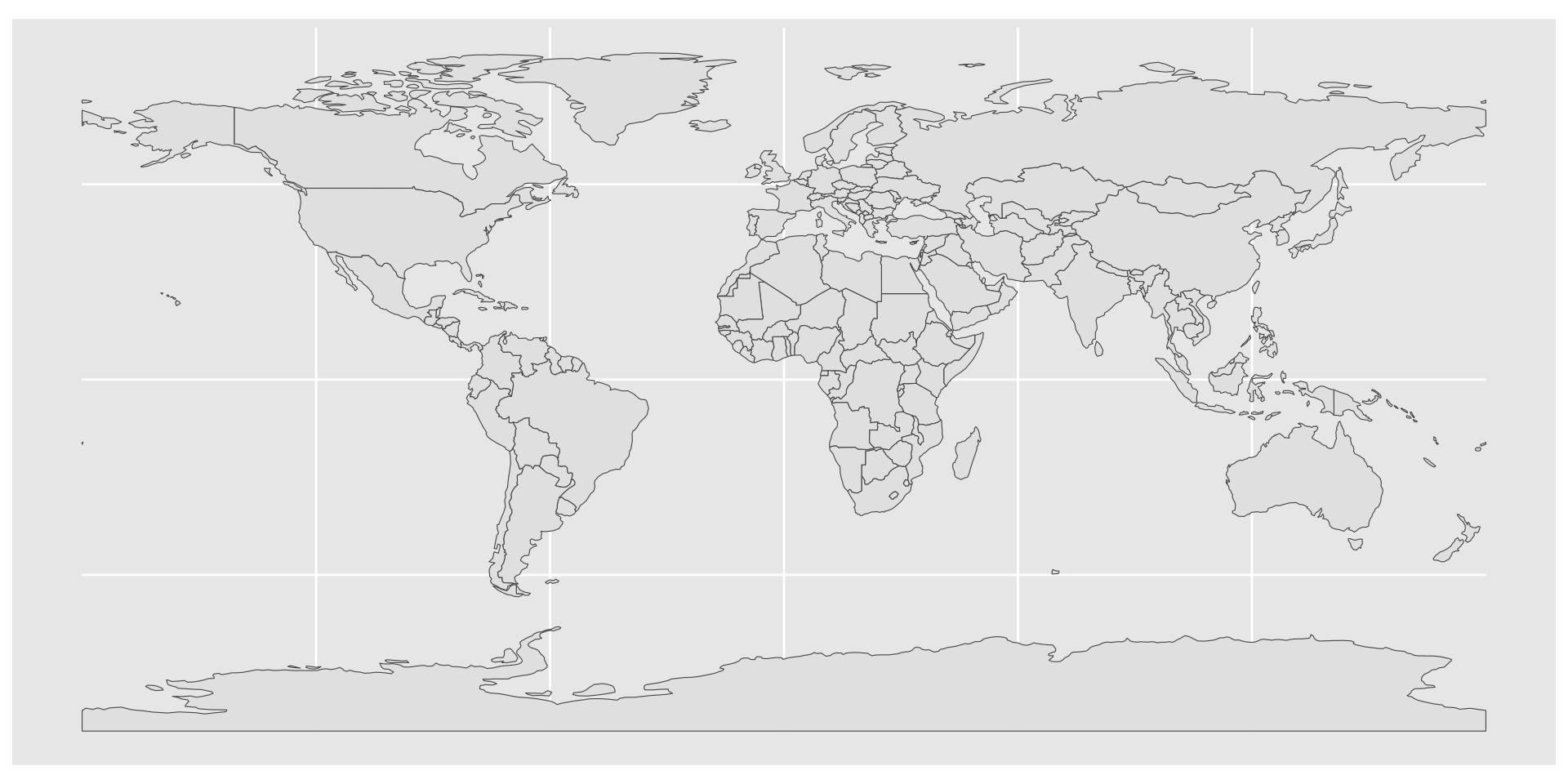
Simple feature collection with 7 features and 3 fields
Geometry type: MULTIPOLYGON
Dimension:     XY
Bounding box:  xmin: -180 ymin: -18.28799 xmax: 180 ymax: 83.23324
Geodetic CRS:  WGS 84
# A tibble: 7 × 4
  TYPE              GEOUNIT                  ISO_A3                     geometry
  <chr>             <chr>                    <chr>            <MULTIPOLYGON [°]>
1 Sovereign country Fiji                     FJI    (((180 -16.06713, 180 -16.5…
2 Sovereign country Tanzania                 TZA    (((33.90371 -0.95, 34.07262…
3 Indeterminate     Western Sahara           ESH    (((-8.66559 27.65643, -8.66…
4 Sovereign country Canada                   CAN    (((-122.84 49, -122.9742 49…
5 Country           United States of America USA    (((-122.84 49, -120 49, -11…
6 Sovereign country Kazakhstan               KAZ    (((87.35997 49.21498, 86.59…
7 Sovereign country Uzbekistan               UZB    (((55.96819 41.30864, 55.92…