Imagine that you manage an information technology (IT) team. Your team receives tickets, or technical issues, from employees. In the past year, you’ve had a couple of people leave and decided at the time not to replace them. You have heard a rumbling of com- plaints from the remaining employees about having to “pick up the slack.” You’ve just been asked about your hiring needs for the coming year and are wondering if you should hire a couple more people.
Fixing the first draft
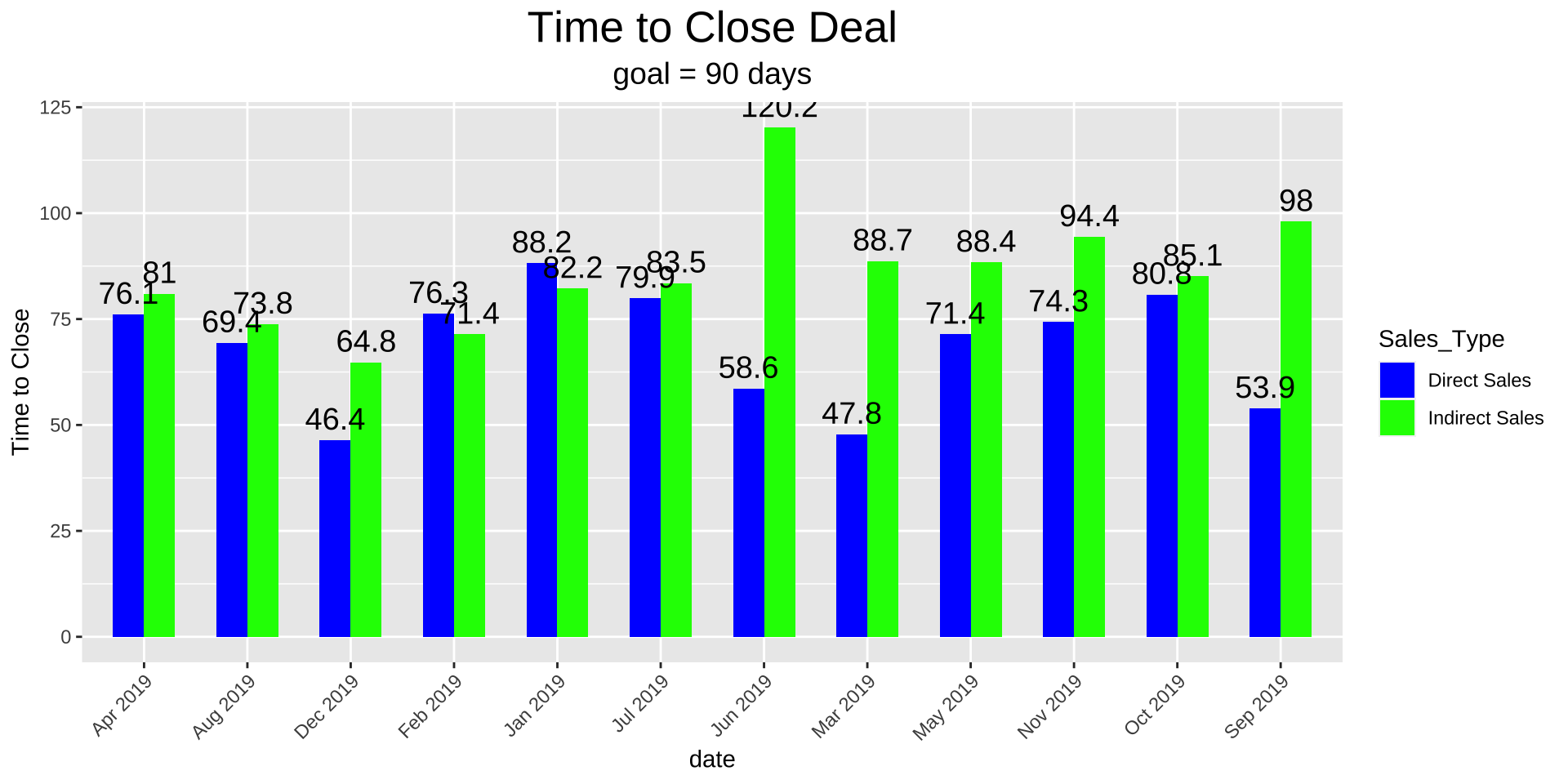
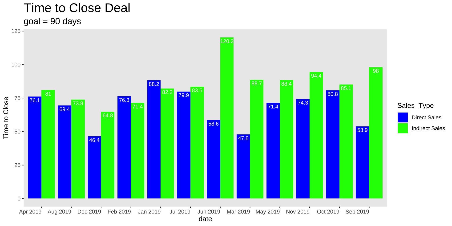
Remove chart border
Remove gridlines
Remove data markers
Clean up axis labels
Label data directly
Leverage consistent color
Decluttering in R
Code
ggplot(data_long, aes(x = MonthYear, y = time_close, fill = Sales_Type)) +geom_bar(stat ="identity", position =position_dodge(width =0.6), width = .6) +geom_text(aes(label = time_close), vjust =-0.5, size =5, position =position_dodge(width =0.6)) +labs(x ="date", y ="Time to Close") +ggtitle("Time to Close Deal") +labs(subtitle ="goal = 90 days") +# Add the subtitle herescale_fill_manual(values =c("Direct Sales"="blue", "Indirect Sales"="green")) +theme(axis.text.x =element_text(angle =45, hjust =1), plot.title =element_text(size =20, hjust =0.5),plot.subtitle =element_text(size =14, hjust =0.5))
How can we reduce clutter in R?
only way to learn how to mess with the elements of the graph is to look at the ggplot cheatsheet and google and practice
I will walk through how I would do it
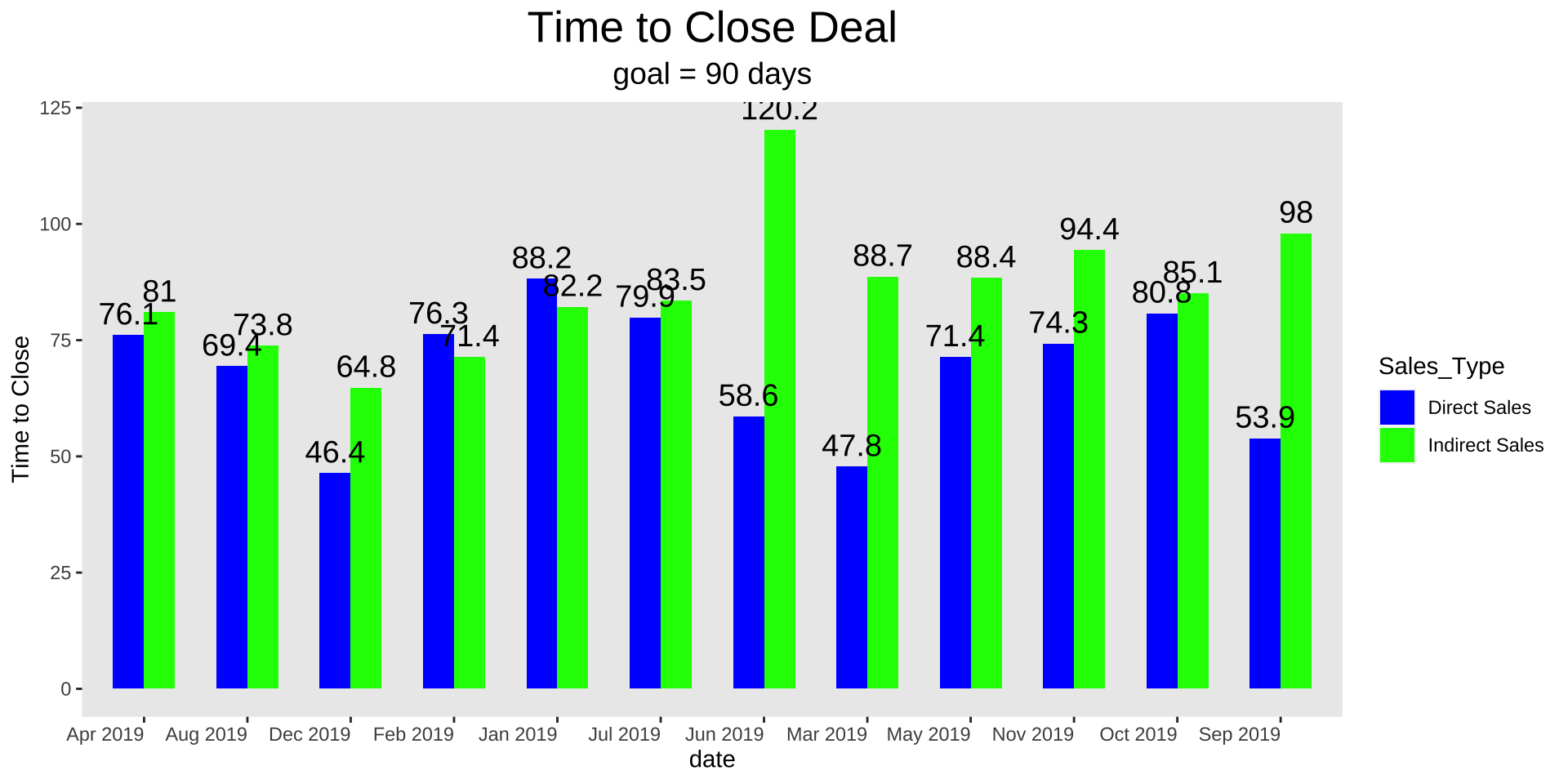
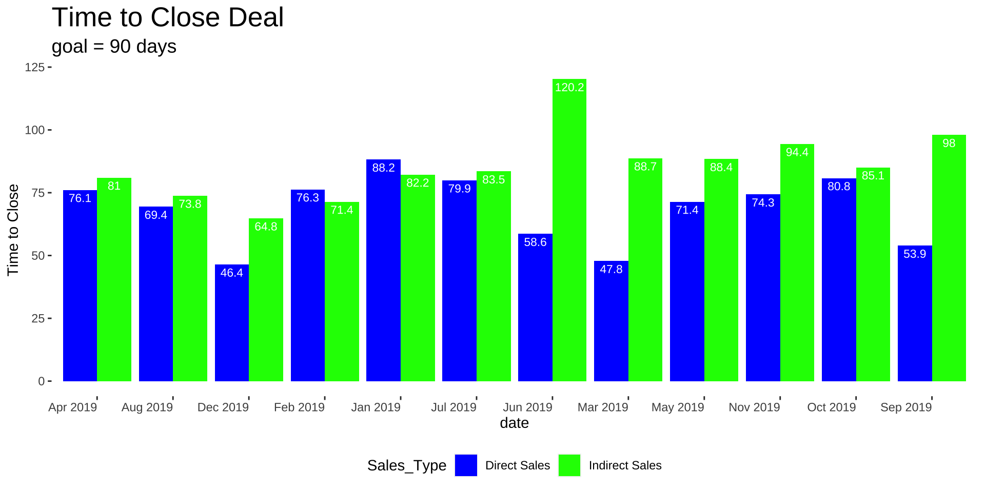
Remove Grid Lines
Code
ggplot(data_long, aes(x = MonthYear, y = time_close, fill = Sales_Type)) +geom_bar(stat ="identity", position =position_dodge(width =0.6), width = .6) +geom_text(aes(label = time_close), vjust =-0.5, size =5, position =position_dodge(width =0.6)) +labs(x ="date", y ="Time to Close") +ggtitle("Time to Close Deal") +labs(subtitle ="goal = 90 days") +# Add the subtitle herescale_fill_manual(values =c("Direct Sales"="blue", "Indirect Sales"="green")) +theme(axis.text.x =element_text(angle =45, hjust =1), plot.title =element_text(size =20, hjust =0.5),plot.subtitle =element_text(size =14, hjust =0.5),panel.grid =element_blank())
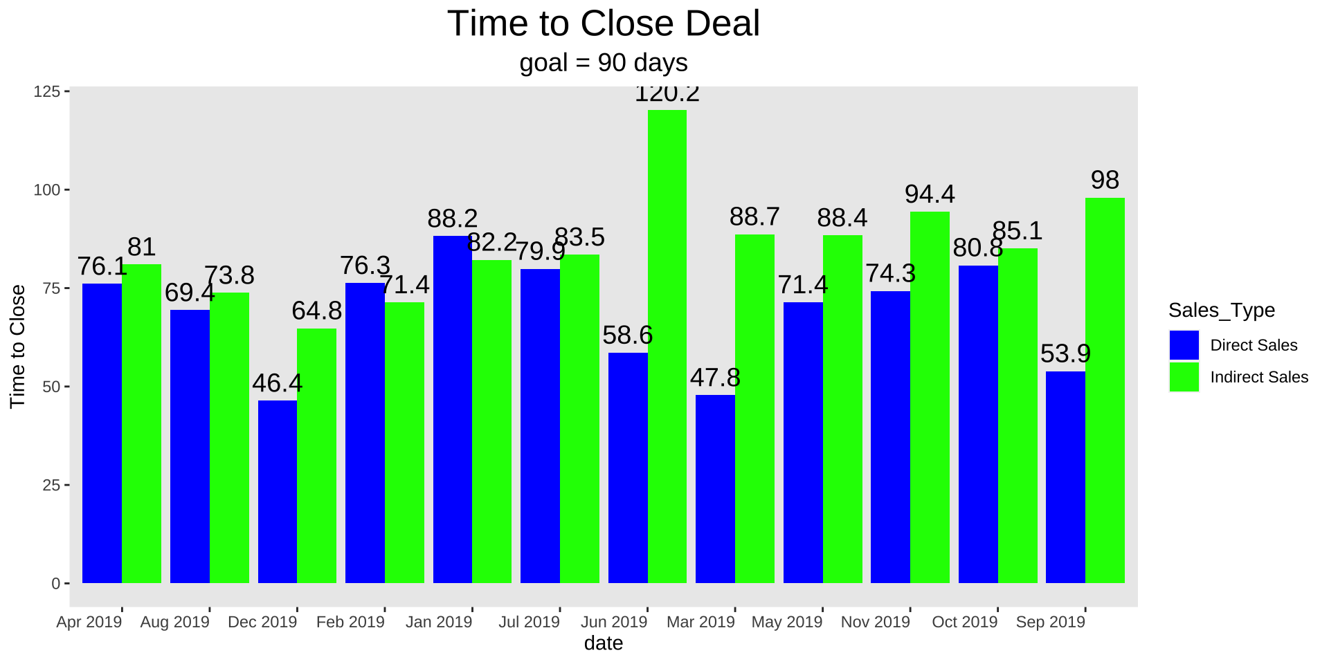
Get rid of 45-degree labels
Code
ggplot(data_long, aes(x = MonthYear, y = time_close, fill = Sales_Type)) +geom_bar(stat ="identity", position =position_dodge(width =0.6), width = .6) +geom_text(aes(label = time_close), vjust =-0.5, size =5, position =position_dodge(width =0.6)) +labs(x ="date", y ="Time to Close") +ggtitle("Time to Close Deal") +labs(subtitle ="goal = 90 days") +# Add the subtitle herescale_fill_manual(values =c("Direct Sales"="blue", "Indirect Sales"="green")) +theme(axis.text.x =element_text(angle =0, hjust =1), plot.title =element_text(size =20, hjust =0.5),plot.subtitle =element_text(size =14, hjust =0.5),panel.grid =element_blank())
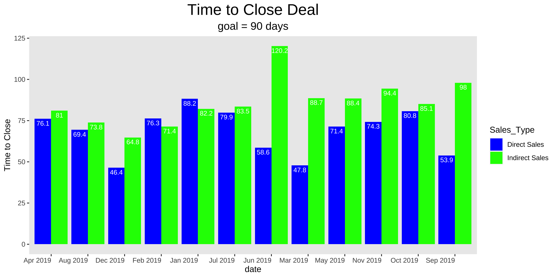
Thicken bars
Code
ggplot(data_long, aes(x = MonthYear, y = time_close, fill = Sales_Type)) +geom_bar(stat ="identity", position =position_dodge(width =0.9), width = .9) +geom_text(aes(label = time_close), vjust =-0.5, size =5, position =position_dodge(width =0.9)) +labs(x ="date", y ="Time to Close") +ggtitle("Time to Close Deal") +labs(subtitle ="goal = 90 days") +# Add the subtitle herescale_fill_manual(values =c("Direct Sales"="blue", "Indirect Sales"="green")) +theme(axis.text.x =element_text(angle =0, hjust =1), plot.title =element_text(size =20, hjust =0.5),plot.subtitle =element_text(size =14, hjust =0.5),panel.grid =element_blank())
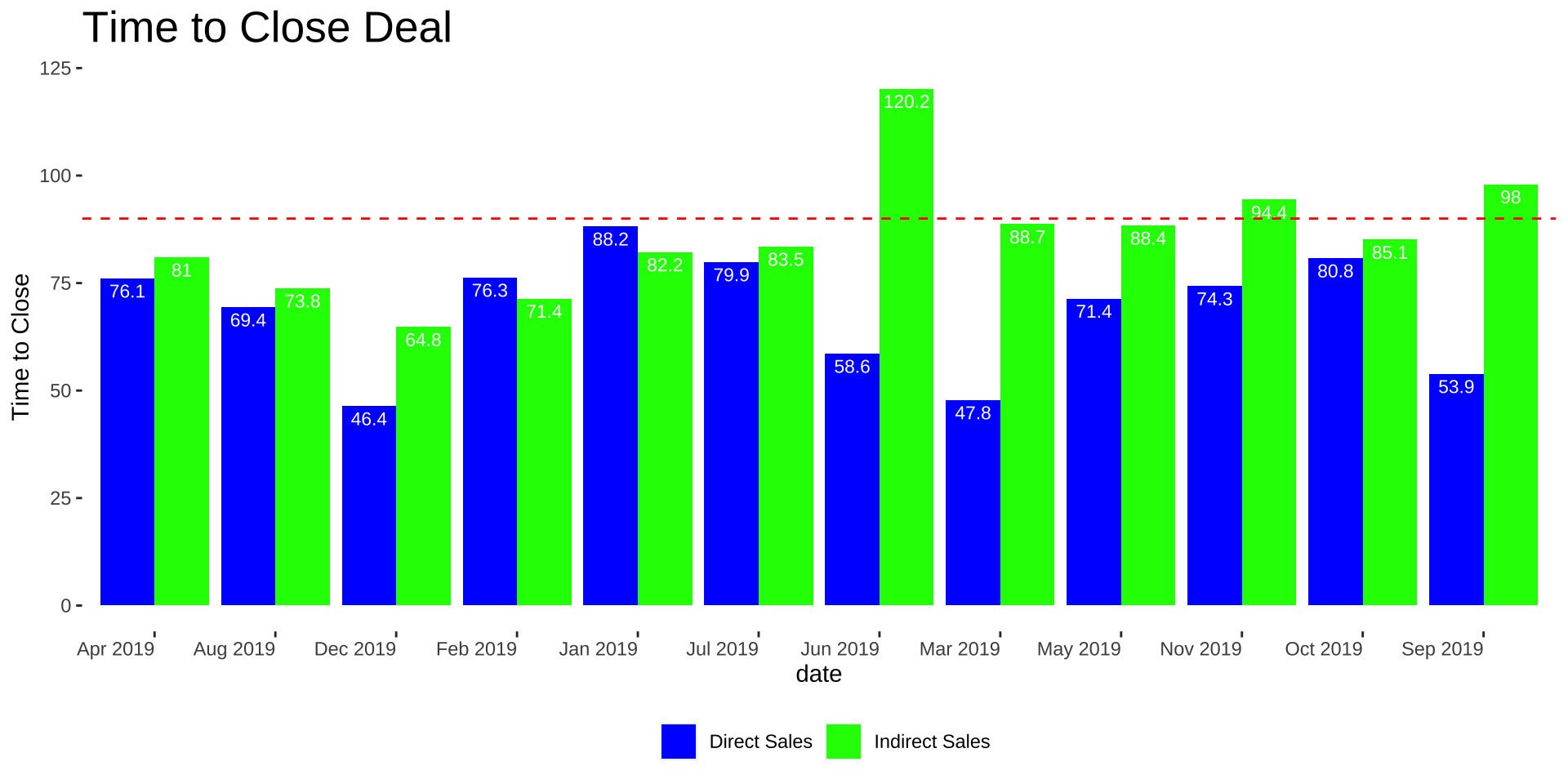
Put labels in bars
Code
ggplot(data_long, aes(x = MonthYear, y = time_close, fill = Sales_Type)) +geom_bar(stat ="identity", position =position_dodge(width =0.9), width = .9) +geom_text(aes(label = time_close), color ="white", vjust =1.5, size =3, position =position_dodge(width =0.9)) +labs(x ="date", y ="Time to Close") +ggtitle("Time to Close Deal") +labs(subtitle ="goal = 90 days") +# Add the subtitle herescale_fill_manual(values =c("Direct Sales"="blue", "Indirect Sales"="green")) +theme(axis.text.x =element_text(angle =0, hjust =1), plot.title =element_text(size =20, hjust =0.5),plot.subtitle =element_text(size =14, hjust =0.5),panel.grid =element_blank())
Move title over
Code
ggplot(data_long, aes(x = MonthYear, y = time_close, fill = Sales_Type)) +geom_bar(stat ="identity", position =position_dodge(width =0.9), width = .9) +geom_text(aes(label = time_close), color ="white", vjust =1.5, size =3, position =position_dodge(width =0.9)) +labs(x ="date", y ="Time to Close") +ggtitle("Time to Close Deal") +labs(subtitle ="goal = 90 days") +# Add the subtitle herescale_fill_manual(values =c("Direct Sales"="blue", "Indirect Sales"="green")) +theme(axis.text.x =element_text(angle =0, hjust =1), plot.title =element_text(size =20, hjust =0),plot.subtitle =element_text(size =14, hjust =0),panel.grid =element_blank())
Make panel transparent and put legend on bottom?
Code
ggplot(data_long, aes(x = MonthYear, y = time_close, fill = Sales_Type)) +geom_bar(stat ="identity", position =position_dodge(width =0.9), width = .9) +geom_text(aes(label = time_close), color ="white", vjust =1.5, size =3, position =position_dodge(width =0.9)) +labs(x ="date", y ="Time to Close") +ggtitle("Time to Close Deal") +labs(subtitle ="goal = 90 days") +# Add the subtitle herescale_fill_manual(values =c("Direct Sales"="blue", "Indirect Sales"="green")) +theme(axis.text.x =element_text(angle =0, hjust =1), plot.title =element_text(size =20, hjust =0),plot.subtitle =element_text(size =14, hjust =0),panel.grid =element_blank(),panel.background =element_blank(),plot.background =element_blank(),legend.position ="bottom", legend.box ="horizontal" )
Remove legend title
Code
ggplot(data_long, aes(x = MonthYear, y = time_close, fill = Sales_Type)) +geom_bar(stat ="identity", position =position_dodge(width =0.9), width = .9) +geom_text(aes(label = time_close), color ="white", vjust =1.5, size =3, position =position_dodge(width =0.9)) +labs(x ="date", y ="Time to Close") +ggtitle("Time to Close Deal") +labs(subtitle ="goal = 90 days", fill ="") +# Add the subtitle herescale_fill_manual(values =c("Direct Sales"="blue", "Indirect Sales"="green")) +theme(axis.text.x =element_text(angle =0, hjust =1), plot.title =element_text(size =20, hjust =0),plot.subtitle =element_text(size =14, hjust =0),panel.grid =element_blank(),panel.background =element_blank(),plot.background =element_blank(),legend.position ="bottom", legend.box ="horizontal" )
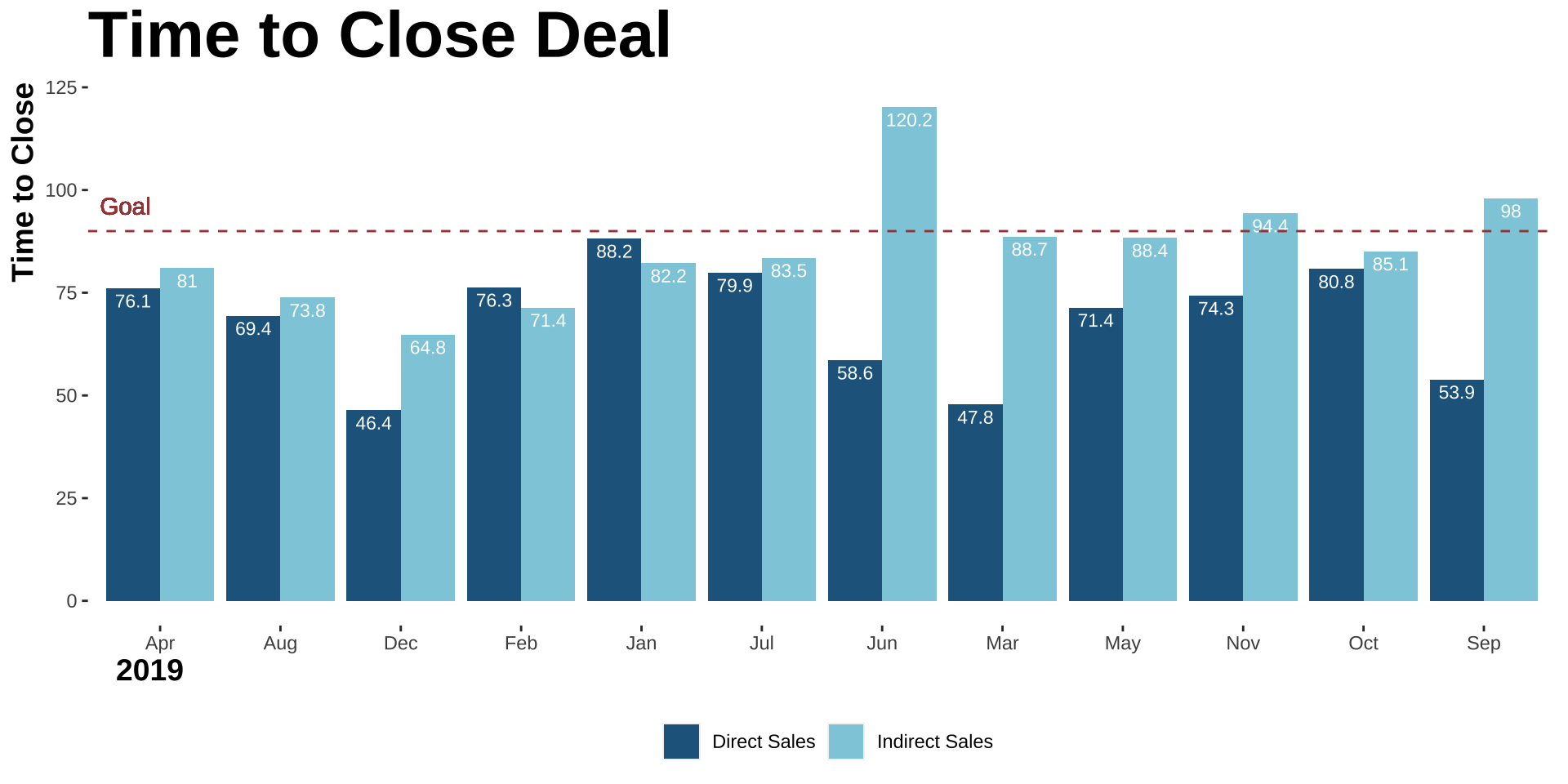
Add goal and remove subtitle
Code
ggplot(data_long, aes(x = MonthYear, y = time_close, fill = Sales_Type)) +geom_bar(stat ="identity", position =position_dodge(width =0.9), width = .9) +geom_text(aes(label = time_close), color ="white", vjust =1.5, size =3, position =position_dodge(width =0.9)) +labs(x ="date", y ="Time to Close") +ggtitle("Time to Close Deal") +labs(fill ="") +# Add the subtitle herescale_fill_manual(values =c("Direct Sales"="blue", "Indirect Sales"="green")) +theme(axis.text.x =element_text(angle =0, hjust =1), plot.title =element_text(size =20, hjust =0),plot.subtitle =element_text(size =14, hjust =0),panel.grid =element_blank(),panel.background =element_blank(),plot.background =element_blank(),legend.position ="bottom", legend.box ="horizontal" ) +geom_hline(yintercept =90, linetype ="dashed", color ="red") +geom_text(aes(x =Inf, y =90, label ="goal"), hjust =0, vjust =-1, color ="red")
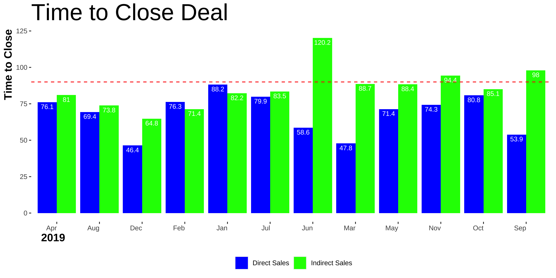
Alter axis labels and titles
Code
data_long$Month <-str_remove(data_long$MonthYear, "\\s\\d{4}$") # Remove the year partggplot(data_long, aes(x = Month, y = time_close, fill = Sales_Type)) +geom_bar(stat ="identity", position =position_dodge(width =0.9), width = .9) +geom_text(aes(label = time_close), color ="white", vjust =1.5, size =3, position =position_dodge(width =0.9)) +labs(x ="2019", y ="Time to Close") +ggtitle("Time to Close Deal") +labs(fill ="") +# Add the subtitle herescale_fill_manual(values =c("Direct Sales"="blue", "Indirect Sales"="green")) +theme(axis.text.x =element_text(angle =0, hjust =1), axis.title.x =element_text(size =14, hjust =0.02, face ="bold"),axis.title.y =element_text(size =14, hjust =1, face ="bold"),plot.title =element_text(size =30, hjust =0),plot.subtitle =element_text(size =14, hjust =0),panel.grid =element_blank(),panel.background =element_blank(),plot.background =element_blank(),legend.position ="bottom", legend.box ="horizontal" ) +geom_hline(yintercept =90, linetype ="dashed", color ="red") +geom_text(aes(x =Inf, y =90, label ="goal"), hjust =0, vjust =-1, color ="red")
Ok the colors are killing me
Code
ggplot(data_long, aes(x = Month, y = time_close, fill = Sales_Type)) +geom_bar(stat ="identity", position =position_dodge(width =0.9), width = .9) +geom_text(aes(label = time_close), color ="white", vjust =1.5, size =3, position =position_dodge(width =0.9)) +labs(x ="2019", y ="Time to Close") +ggtitle("Time to Close Deal") +labs(fill ="") +# Add the subtitle herescale_fill_manual(values =c("Direct Sales"="#22668D", "Indirect Sales"="#8ECDDD")) +theme(axis.text.x =element_text(angle =0, hjust =0.5), axis.title.x =element_text(size =14, hjust =0.02, face ="bold"),axis.title.y =element_text(size =14, hjust =1, face ="bold"),plot.title =element_text(size =30, hjust =0, face ="bold"),plot.subtitle =element_text(size =14, hjust =0),panel.grid =element_blank(),panel.background =element_blank(),plot.background =element_blank(),legend.position ="bottom", legend.box ="horizontal" ) +geom_hline(yintercept =90, linetype ="dashed", color ="#A94442") +geom_text(aes(x = .5, y =90, label ="Goal"), hjust =0, vjust =-1, color ="#A94442")