Choosing a visual and themes
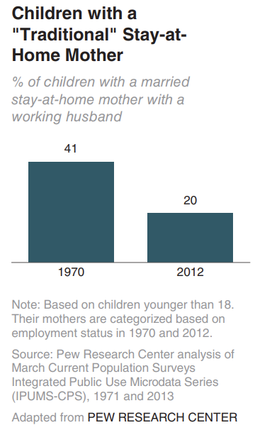
20%
of children had a
traditional stay-at-home mom
in 2012, compared to 41% in 1970
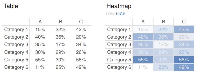
Heatmaps
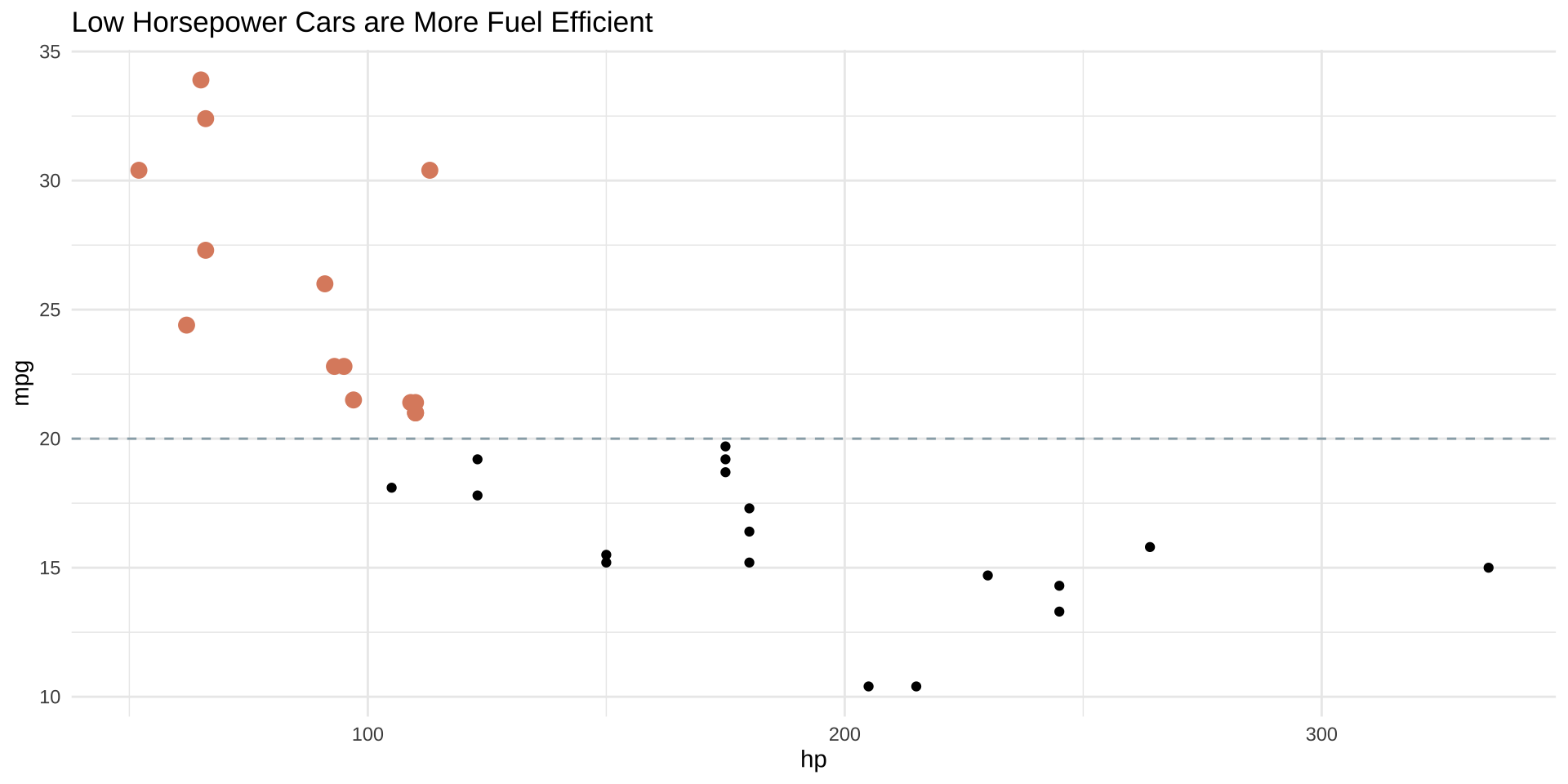
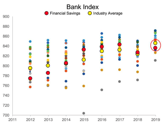
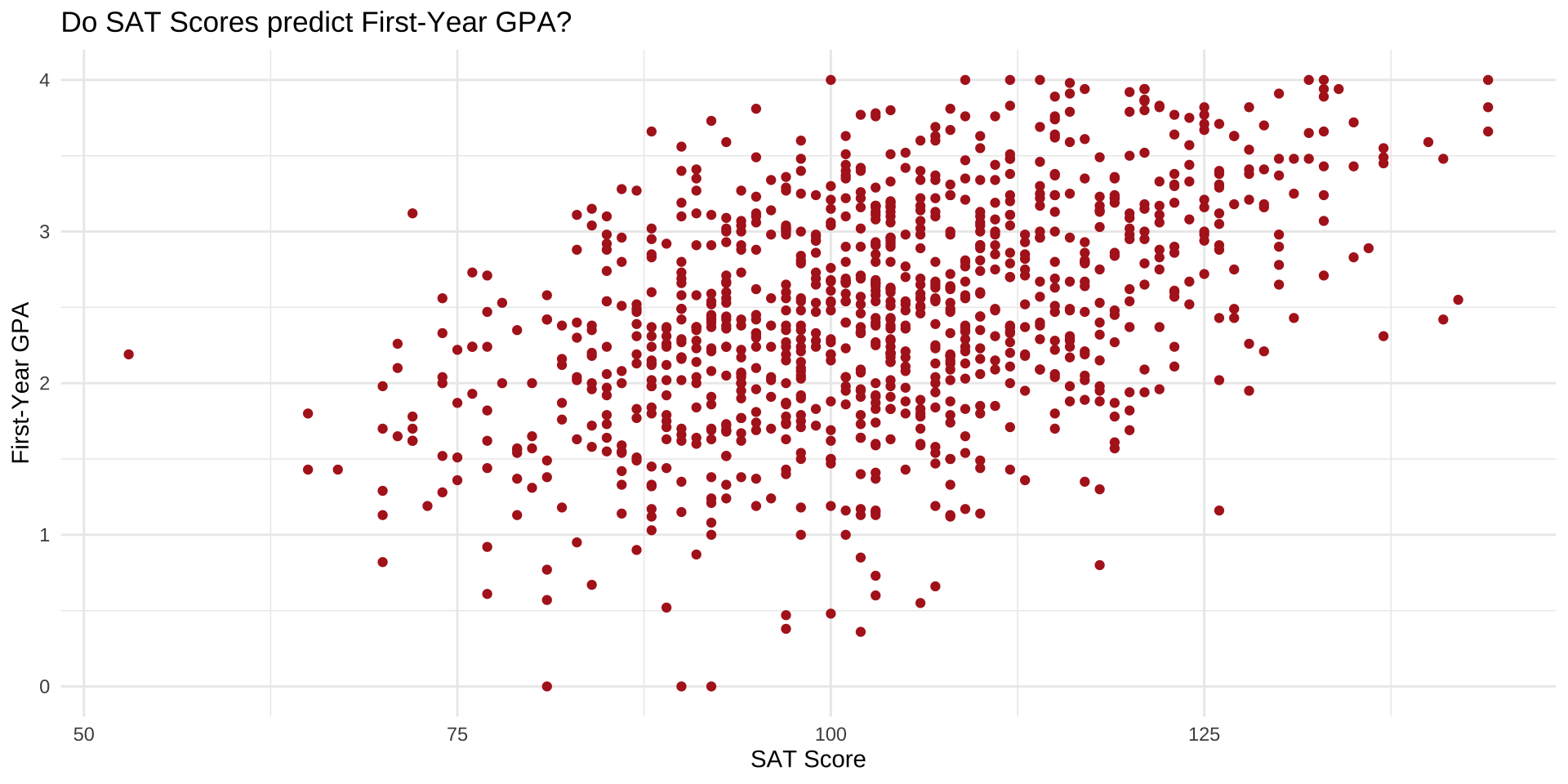
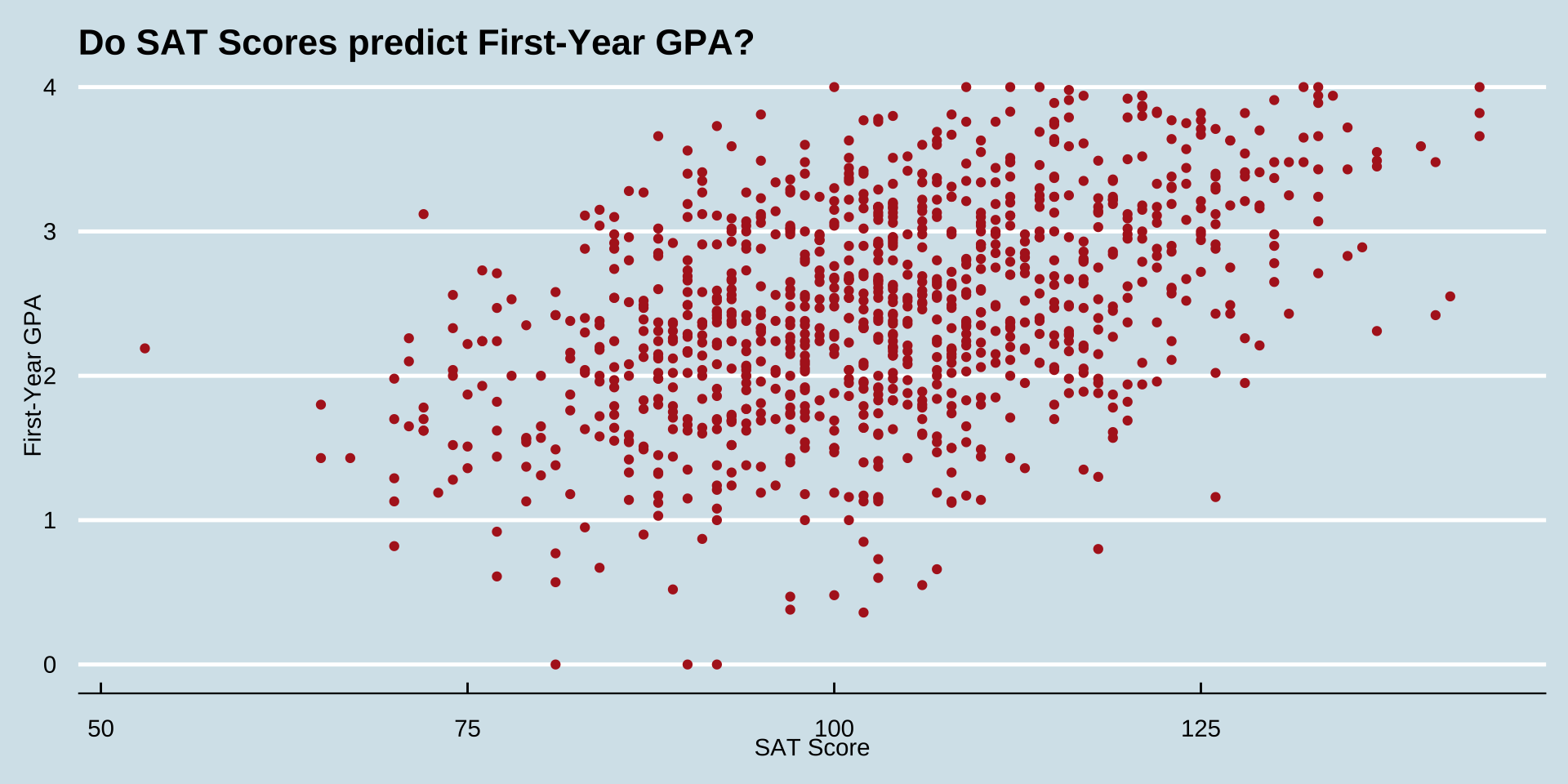
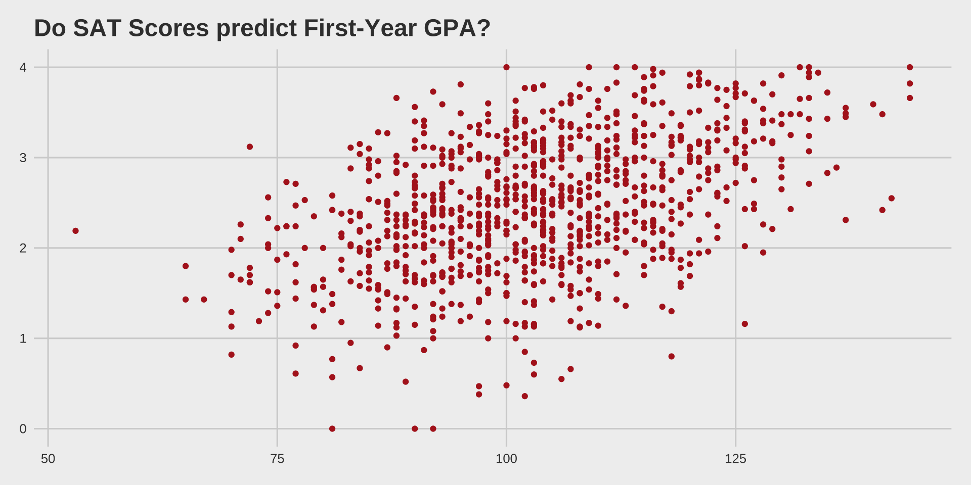
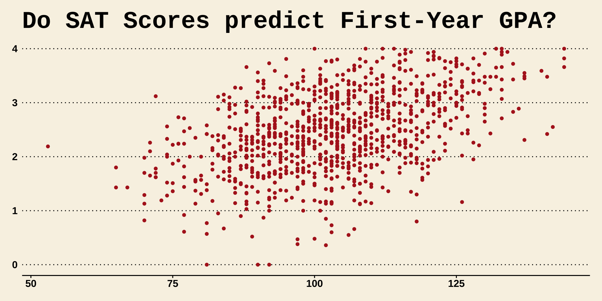
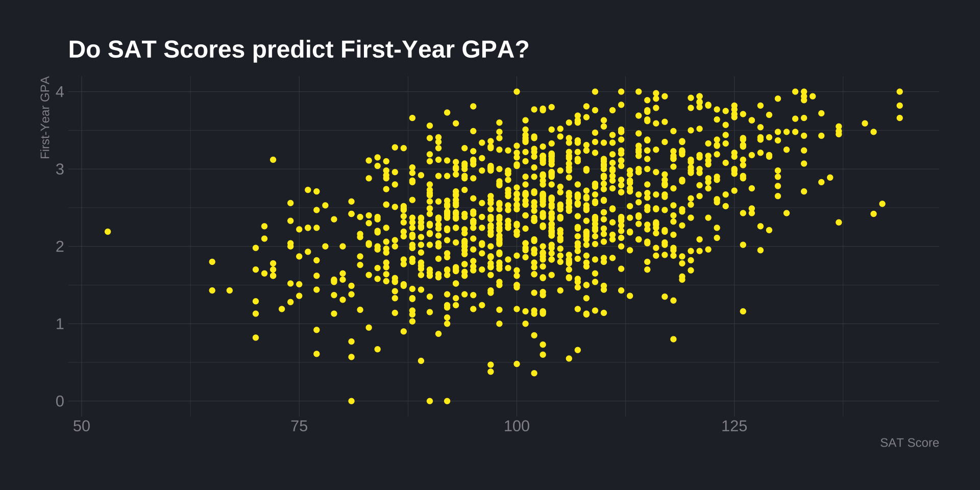
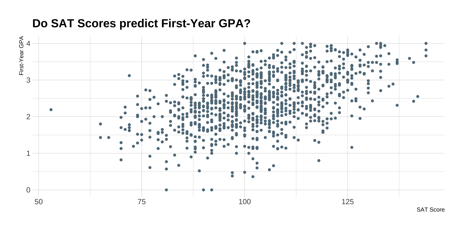
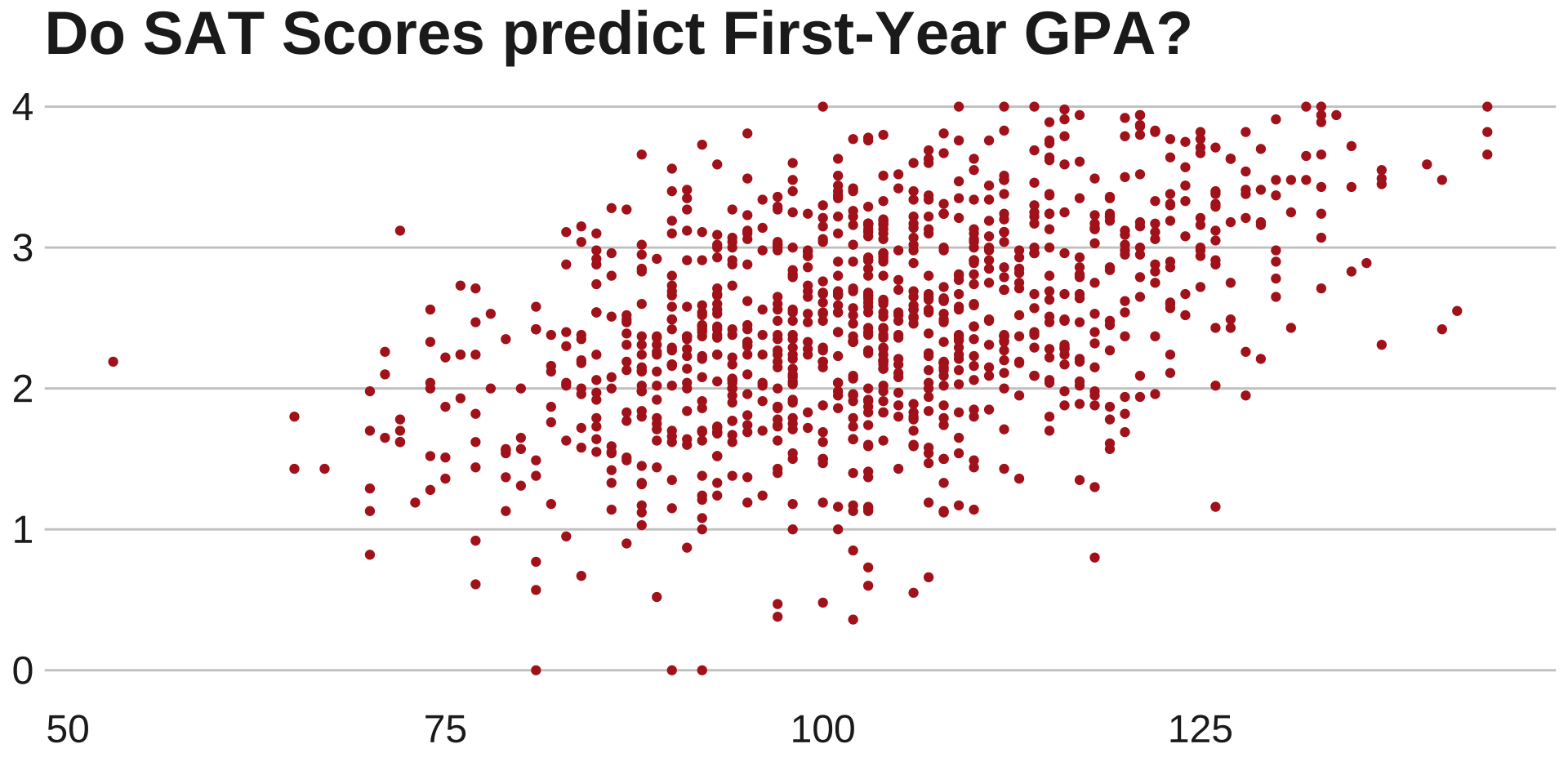
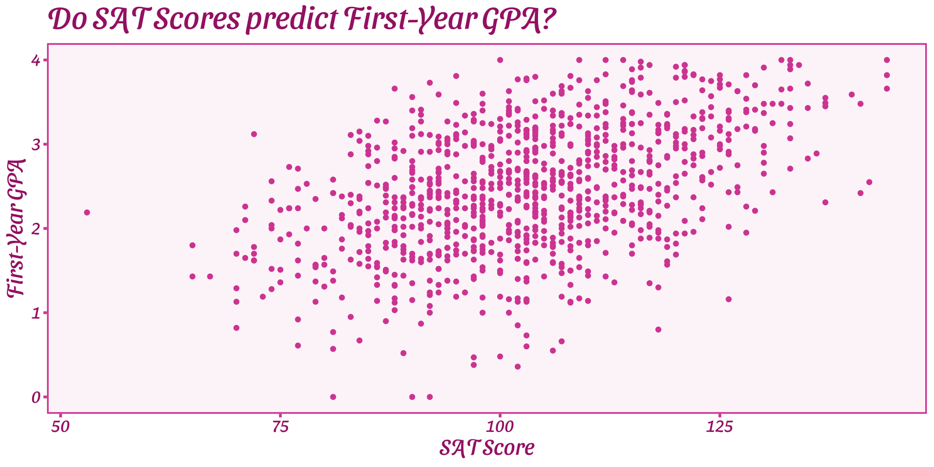
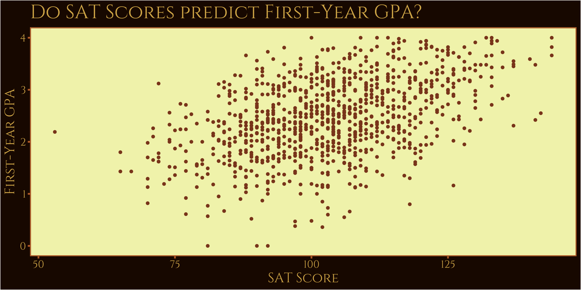
Scatterplots
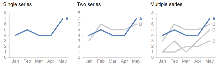
Line graphs
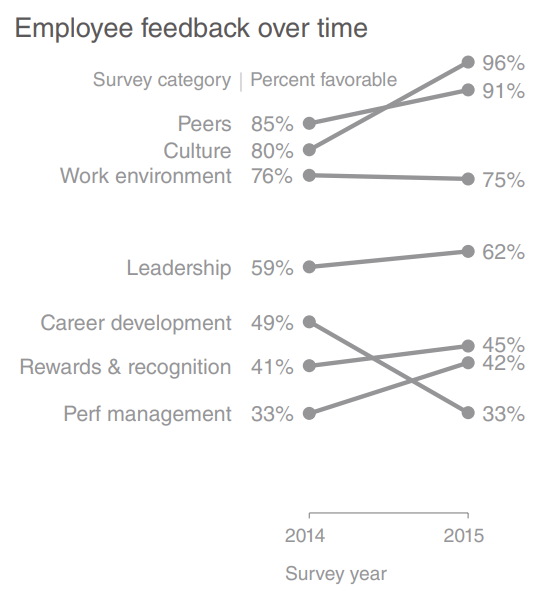
Slope graphs
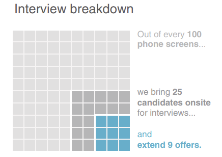
Waffle
Critique
Minimal
Economist
Five Thirty Eight
WSJ
HRBR FT
HRBR Ipsum
BBC
Barbie
Game of Thrones
For next time
- Read “Reducing Clutter”
- Complete the “themes” assignment in Rstudio cloud